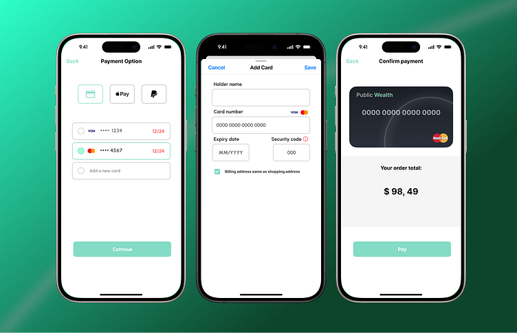
Payment Flow UI Design
Here’s a recent project where I focused on designing a seamless and intuitive payment flow. The design includes three main screens: payment option selection, card addition, and final confirmation.
Key Features:
User-Centric Design: A clean, minimal interface that guides users through the payment process with ease.
Visual Hierarchy: Clear distinction between primary and secondary actions to prevent user errors.
Consistency: A cohesive design language that ensures a smooth experience across all steps.
I aimed to create a balance between aesthetics and functionality, ensuring that the user experience is both efficient and enjoyable.
Would love to hear your thoughts and any suggestions for further refinement!
More by Moloko Chris Poopedi View profile
Like

