DAY 05 - APP ICON DESIGN | 100 DAYS UI CHALLENGE
Day 05 UI Challenge - App Icon
Hey Dribbblers! 👋
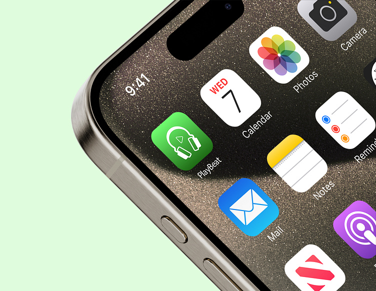
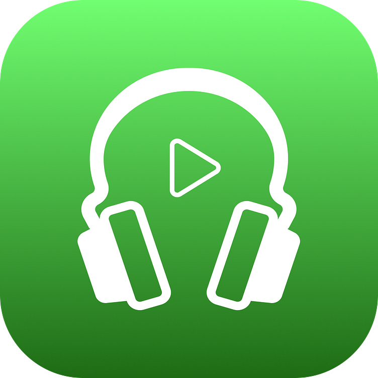
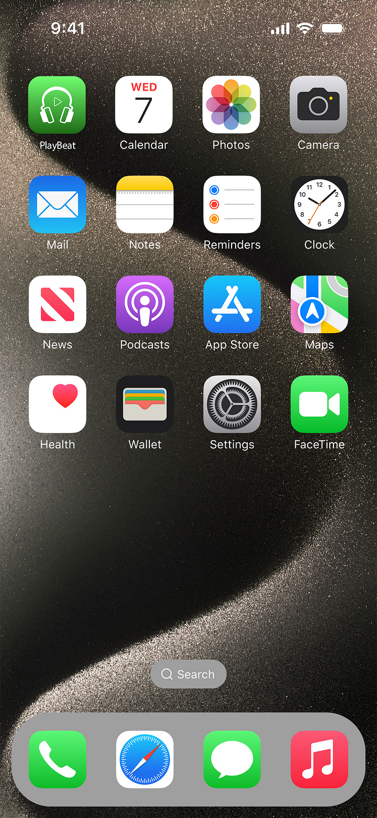
Thrilled to share my design for Day 5 of the UI Design Challenge—an app icon for a music app! 🎶
Design Concept: I aimed for a clean and modern aesthetic with this icon, combining the essential elements of headphones and a play button. The goal was to create an icon that's instantly recognizable and conveys the app's primary function—listening to and enjoying music.
Key Features:
Headphones: Represent the app’s focus on delivering a great audio experience. The design is minimalistic to keep the icon sleek and clear.
Play Button: Centrally placed to highlight the core functionality of media playback.
Color Scheme: The vibrant Neon Green (#39FF14) background symbolizes energy and freshness, while the white (#FFFFFF) icon elements ensure strong contrast and visibility.
The result is an eye-catching, intuitive icon that stands out on any device screen, from smartphones to tablets. It’s designed to resonate with music lovers and make the app easy to find in any app drawer.
Would love to hear your thoughts!
