Website Animation for It Consulting Company | OTIS
Greetings, everyone! 🤩
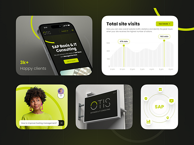
Our design approach involves understanding the user journey and creating interfaces that seamlessly guide users to their goals. For the OTIS SAP Basis and IT Consulting website, we focused on crafting a desktop landing page that is visually appealing and highly functional. By selecting a bold yellow and black color scheme, we ensured the interface was striking and easy to navigate. The contrast between these colors was chosen deliberately to enhance readability and draw focus to key areas, making it simple for potential clients to locate the information they need. 💻
Our goal was to create a design that reflects OTIS’s commitment to excellence and innovation in SAP Basis and IT consulting. Every element, from the logo's placement to the navigation bar's positioning, was thoughtfully designed to ensure clarity and ease of use. This attention to detail, combined with our understanding of the latest design trends and user experience principles, resulted in a website that looks professional and functions efficiently, providing a seamless experience for users. 👍🏼
Stay tuned for more of the design and development process! 💙
If you like this shot, please give it a ❤️
Hit the 'L' key if you enjoy this design!
❤️ Press L to support me

