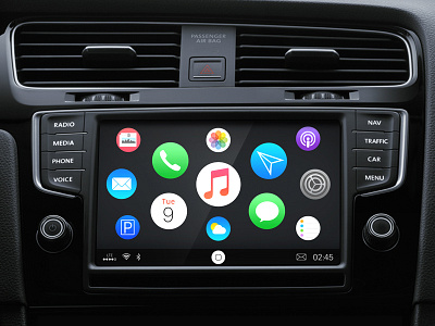
CarPlay Proposal (Home, Map, Music)
Ever since I owned my original 1st generation iPhone, I wanted seamless integration with my automobile, mainly because of „ coverflow“. As time passed by and we now have „ CarPlay“ I have followed the development towards automobile integration and have been somewhat dissapointed.
As a professional designer for automotive user interfaces I truly believe that CarPlay has so much more potential, especially with regards to the user interface and the user experience:
- The Home Button. Why is it on the left hand side? This is both inconsistent and honestly, looks a little „goofy“. Begs the question does it move from left to right depending on whether you drive in the USA, mainland europe or in the U.K. or Japan? I believe that moving the „status bar“ to the bottom of the screen, (which is the defacto standard on all automotive user interfaces I am familiar with), and where the complete status bar can also be utilised as a „ back“ button would be an easy change and a big improvement. If the car has a hard key „ back button“ so don’t need to show the back to home icon.
- The Home Screen. Why large square buttons? Looks really old fashioned and boring. After seeing the changes in user interface recently released with the Apple Watch Watch OS, I see an improved end user experience and benefits in moving also to round buttons in the CarPlay UI. If the system just has a knob and not a touch screen, then for selection only the middle icon is active. The transition would the same as the Apple Watch home screen animation.
And so on and so forth… Take a look for more insights, you can find my proposal screens for the CarPlay map and the music player here:
http://minimalist.cn/portfolio/apple-carplay-concept/
