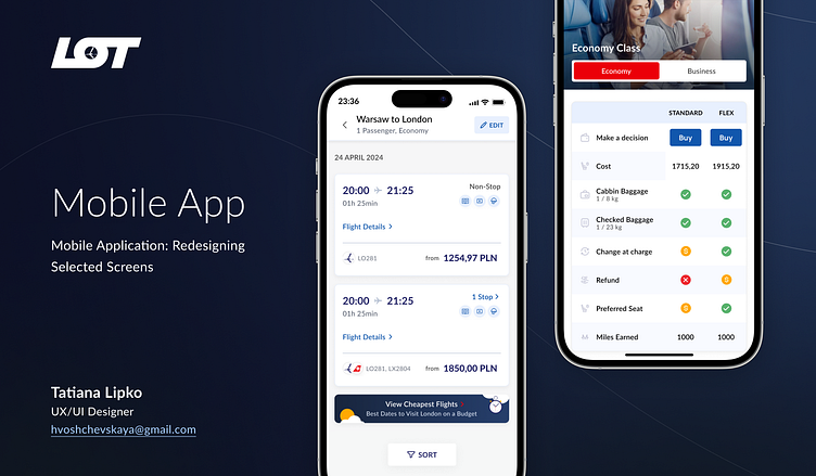
Enhancing UX and UI for Key User Flows for an Airline Company
Overview: As a UX/UI Designer, my goal was to enhance the user experience and interface for a critical user flow within an airline mobile application. The objective was to streamline the process, improve user satisfaction, and create a more intuitive and visually appealing experience.
Process:
Process Planning: I began by outlining a clear and structured plan to guide the project from start to finish, ensuring that each phase was aligned with the overall goals.
UX/UI Analysis of the Current State: I conducted a thorough analysis of the existing user flow, identifying pain points, inefficiencies, and areas for improvement. This involved mapping out the current journey and gathering user feedback to understand the challenges faced by users.
Content Prioritization: I prioritized content based on user needs and business goals, ensuring that the most critical information was accessible and easy to navigate. This step was crucial in reducing clutter and improving the overall usability of the interface.
Design for Selected Screens: I redesigned key screens, focusing on enhancing usability and visual appeal. The new designs aimed to simplify interactions, reduce friction, and guide users more effectively through the flow.
Created Styles in Figma: I developed a consistent and cohesive design system in Figma, including styles, components, and guidelines that could be applied across the platform. This ensured that the redesign was not only visually appealing but also scalable and easy to maintain.
Outcome: The redesigned user flow led to improved user satisfaction, a more intuitive navigation experience, and a visually consistent interface that aligned with the airline company's brand. The process-driven approach and attention to detail in design and analysis were key to the success of this project.

