Game On 🎾 2NDCourt Web Application
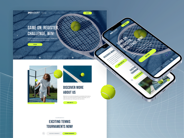
When it comes to designing a digital experience that captivates and engages, the tennis tournament application you see here is a testament to thoughtful and user-centric design 🎾. The deep blues combined with vibrant tennis ball greens create a visually appealing contrast that not only grabs attention but also enhances readability. This color scheme is carefully chosen to reflect the dynamic and energetic spirit of tennis while maintaining a modern and professional look.
The choice of fonts here plays a crucial role in delivering information clearly and elegantly ✨. The bold headlines ensure that key messages stand out 💡, while the clean, sans-serif body text provides a smooth reading experience across all devices. This balance between boldness and simplicity ensures that users can easily navigate the app and find the information they need without distraction 🎯.
One of the standout features of this design is its intuitive navigation and layout. By employing a responsive design, the application maintains its aesthetic and functional integrity across all devices, from desktops to smartphones 📱. The interactive elements, such as the call-to-action buttons and the seamless integration of imagery 🎨, guide the user effortlessly through the app, making the journey from browsing to booking a tournament both enjoyable and straightforward. In every aspect, this design demonstrates a commitment to enhancing the user experience, ensuring that each interaction is as smooth as a perfectly served ace 💥.
Let`s work together!


