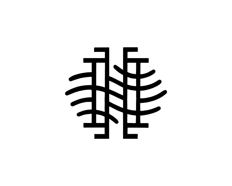
H.H. Monogram / H Mark
Letterform practice. Sketched and inked in Procreate. I still prefer to hand draw over a grid vs. paths and points. The subtle imperfections and asymmetry add just enough character.
My nephew is a little hockey player and I had this idea to create him a custom logo that he could put on his bag and gear. I started playing around with geometric shapes and angles to establish the H.H. monogram, using the serifs and stems to create a nod to the shape of hockey sticks. I added the flowy organic lines to make it more interesting and stylish, and think this plays on a skater's curved lines their blades cut in the ice.
Because I connected the serifs to each set of stems this could visually work as a singular "H" form or more abstractly as an "H.H." monogram as I started it.
I envision using this on letterhead, a stamp, or a logo on a bag tag.
