Top navigation - User menu
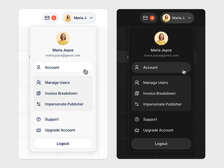
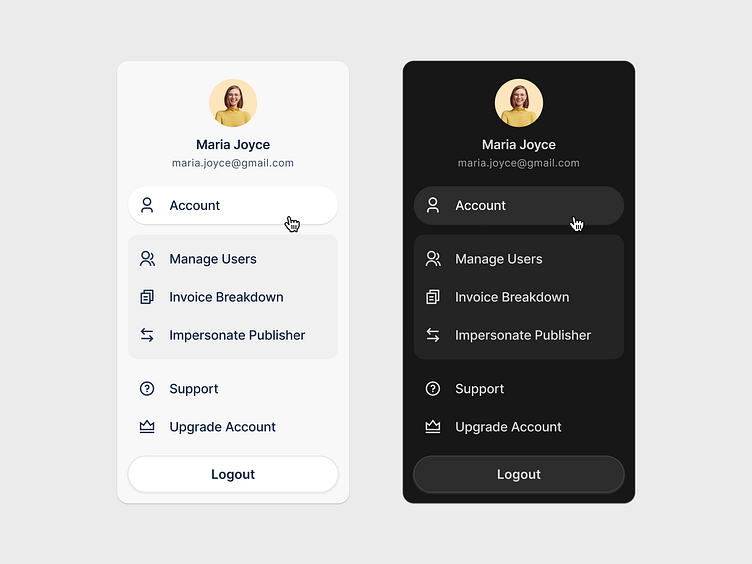
When comparing the user dropdown menu in the top navigation between light mode and dark mode, several differences in color contrast become evident, impacting both aesthetics and usability.Hover effects and active states might use slightly darker or subtle shadowing, maintaining a clean and minimalistic appearance.
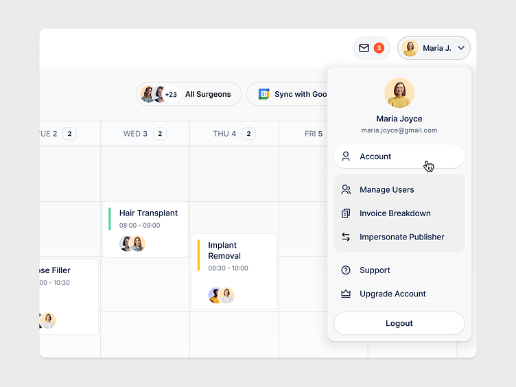
In the light mode typically features a white or very light background, complemented by dark text and icons ensures excellent readability and clarity, especially in well-lit environments
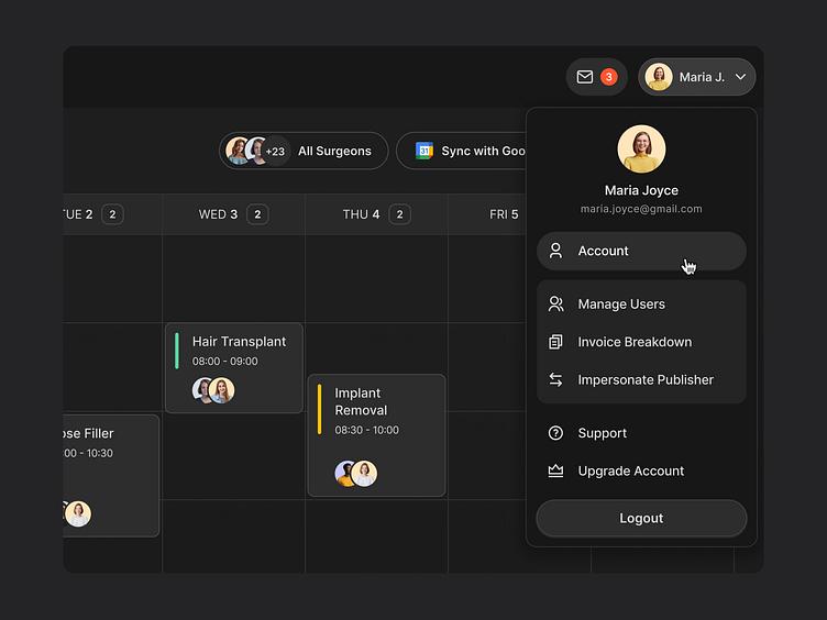
In the dark mode the menu adopts a dark background, often charcoal or deep gray, with light-colored text and icons. This inversion of color contrast provides a soothing experience in low-light environments, reducing eye strain.
Feel free to share your thoughts 👋
I would love to hear your thoughts and advices about this work to help me to improve my perception and vision for my future projects.
