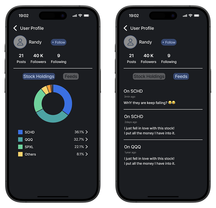
Dark Mode (Enhanced Securities App Version)
In a previous project, I designed a profile screen for a securities app.
I'm not entirely sure which term is more accurate between 'Held Stocks' and 'Stock Holdings', but I believe 'Stock Holdings' is more appropriate.
While creating the dark mode, I also made a small change to the light mode.
I adjusted the opacity of unselected buttons. On the left screen, it's the 'Feeds' button, and on the right screen, it's the 'Stock Holdings' button. I aimed to make it clearer to users that the button is unselected.
More by Randy View profile
Like

