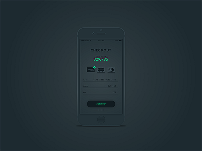
Dark Credit Card Checkup UI


I'm trying to use the DailyUI Competition to escape from my daily business and to try different approaches.
This time I worked with a low contrast and highlighted only the most important things. It'll never win an award for accessibility :D
What do you think about it?
Please view it @2x
Cheers!