SOVENA | PACKAGING DESIGN

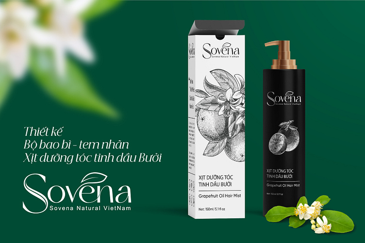
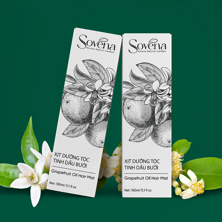
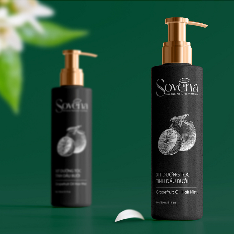
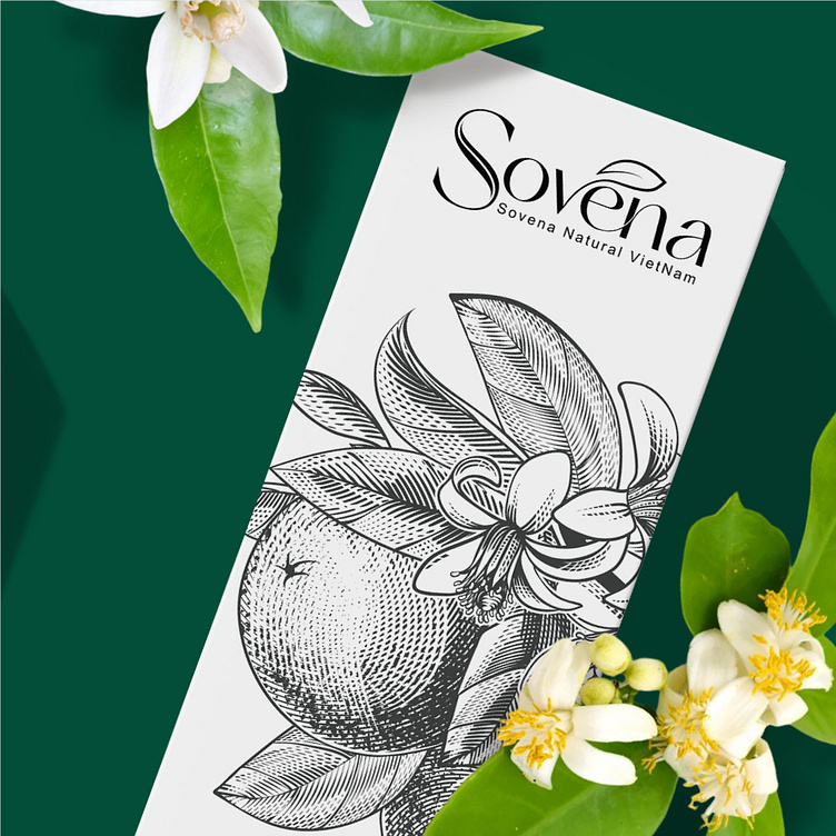
Sovena Grapefruit Essential Oil Hair Care Packaging is delicately designed to incorporate ingredients such as grapefruit flowers and grapefruit peel, showing the natural origin of the product. These images enhance the aesthetics of the packaging as well as reinforce the belief in the ingredients in Sovena Hair Care Spray. In addition, the packaging also uses a modern, clear sans-serif font, helping to convey information in an easy-to-understand way to consumers. The Sovena brand name is written large and prominently, helping customers easily recognize the brand.
The packaging uses 2 main colors, black and white, these are 2 basic tones but have many meanings for hair care product packaging. White represents the cleanliness and purity of grapefruit essential oil products, while black represents the mystery and class of the product, and also evokes a sense of strength and reliability. These two colors are used alternately to create balance and harmony in the product packaging design. Overall creates an impressive, unique packaging.
-
Client Sovena
Packaging Design Project. Packaging is designed for Sovena.
Copyright© Bee Art. All Right Reserved
Contact us:
• Hotline/ Zalo: (+84) 77 34567 18
• Email: info@beeart.vn
• Website: www.beeart.vn
• Facebook: https://www.facebook.com/BeeArt.vn