My new text logo

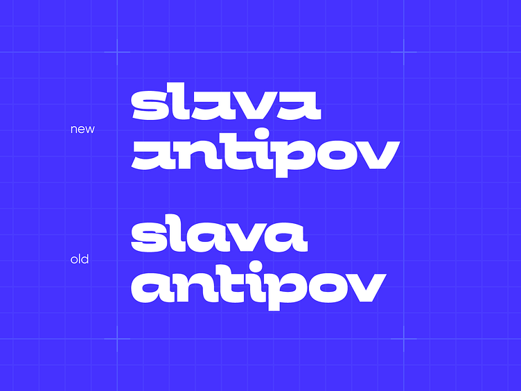
I've recently updated my text logo, which I use on my covers. I've completely redrawn the inscription, and now it looks like this. The structure of the letter "a" references its two-part form in the main logo (icon), and it also becomes more square. The remaining letters adopt a similar geometry: the upper part has a right angle, the lower part has a rounded curl. The pair "ti" becomes a ligature.
Portfolio and other social networks:
Telegram | Instagram | Behance | Vkontakte
My email: antipslava.design@gmail.com
