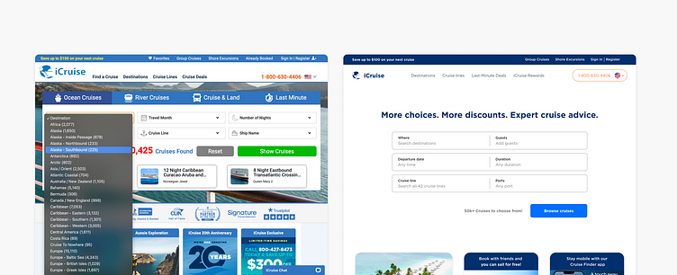
(🛳️ Redesign 1/4) Cruise booking website redesign - home
Website redesign for a cruise booking platform
Est read time: 4 minutes
Background
I recently had the opportunity to interview at a global travel company (spoiler alert, I didn't get the job). During the interview process I learned about the project they were hiring for and was excited about the design challenges I'd potentially have to tackle.
After having my third, final-round interview and while I was waiting for the final decision, I couldn't help but get some of my ideas down in Figma and here's the progress I made in two days.
The challenge
The first project of the job was going to be focused on redesigning one of their websites to align with their updated visual identity as well as create some funnels into their rewards program.
Day 1: Search
I spent the first day obsessing over the site's search feature, focused on smoothing out the experience and creating a little more flexibility for users.
I came into this with some previous research of cruise customer groups as preparation for the final interview and now needed to spend some time researching customer's top priorities when booking a cruise in order to create the landing page's main search categories.
After completing research via competitive research, reading travel websites, asking chat-gpt, and interviewing a frequent cruiser (thanks MIL!) I created the 6 main search inputs along with a taxonomy for iCruises originally listed 40+ destination choices focusing on organizing the destinations into 2 main buckets with checkboxes to allow for browsing multiple locations at once (popular destinations & destinations by region). Additionally, I integrated the original website's 'river cruises' and 'cruise and land' categories inside.
Guests were a new category I chose to add in order to help customize search results for different user groups. Families with children vs senior adults have different preferences and catering for their needs was something I wanted to consider.
I also wanted to add some flexibility to the date search to allow users to browse between specific dates or more generally across months.
Day 2: Reorganizing page content
Coming in the next day, I looked at the overall page structure and content.
Knowing one of the company's primary goals was to convert more of their visitors into rewards program users, I highlighted the value for signing up for 'iCruise Rewards' as the largest card in the next section under search. I also used this space to highlight some of the company's other value propositions (sailing for free if you book with friends, the cruise finder mobile app, a 20th anniversary drawing, and their newsletter) and was able to free up space for the next section's 'popular cruises'.
Understanding the importance of instilling customer confidence in the brand, the last section I wanted to include was to highlight awards & recognition the company had earned.
Visual identity & accessibility considerations
Finally, by using the palette and design patterns their newer 'iCruise Rewards' website, I refined the components throughout with defined palette, corner radius, and spacing. To ensure top-tier WCAG accessibility for users, I made sure to check contrast ratios used throughout the cards on the homepage.
To be continued...
There were a deceivingly large number of challenges to solve throughout this homepage redesign and I had a blast tackling them one at a time. I'm grateful for the company's serious consideration in bringing me on and although I'm bummed to not have made the final cut, I've still got some work I want to continue as I translate what I'm visualizing in my head into Figma.
I'm looking forward to adding updates and challenging myself further as I bring this to life with some animation and tackle the search results page (along with the filtering options - something I really value in e-commerce websites).


