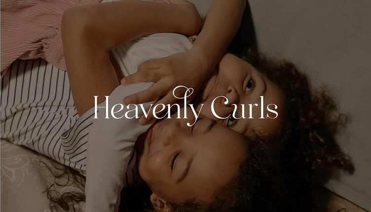
Heavenly Curls | Brand Identity & Packaging Design
Heavenly Curls
Services: Brand Strategy, Brand Identity, Print & Packaging Design
Project Brief: Heavenly Curls offers silk/satin hair care products for children with curly hair, centred around ‘The Bonnie’—a sleeping bonnet. The goal is to empower kids to love and care for their curls, with branding that’s clean, simple, high-end, and Italian-inspired, yet playful and kid-friendly.
Solution: I crafted a brand identity that empowers children to embrace their natural curls through diverse, relatable patterns. The design combines high-end sophistication with playful colours and illustrations, appealing to kids while celebrating inclusivity. This cohesive identity stands out and resonates with the target audience.
Logo Concept
The logo features minimalist black typography in a serif font, conveying luxury and high quality. Customised letters with swirls, curves, and flicks mimic various curl types, representing the diversity of curly hair.
Colour Palette
The colour palette is youthful and playful, featuring pastel shades like pink and blue, alongside more gender-neutral tones. This blend ensures the brand feels both child-friendly and sophisticated.
Icons & Illustrations
I refined the existing ‘Bonnie elephant’ illustration by adjusting the colour palette to softer, more sophisticated tones. I also created a collection of coloured circle icons which could be used as ‘Instagram Highlight Icons’ or buttons on the website.
Brand Pattern
The core brand pattern for Heavenly Curls spells out "Heavenly Curls" with each letter in a unique typeface featuring a ‘curly’ effect. For example, the ‘E’ has a spiral look, while the ‘S’ has a gentle wave. These variations represent the different types of curly hair—curls, kinks, coils—and appeal to children across age ranges. Kids can spot and identify the letters that resemble their own curl pattern. This pattern is both sophisticated and child-friendly, perfectly aligning with the brand’s values and mission.
Product Design
Themed Patterns for The Bonnie Collection
The client had already initiated the creation of themed patterns for the silk Bonnie collection, including Ballet, Superhero, Magic, Sports, Star, and Zoo themes—offering a range of relatable prints for kids of different ages and genders. While these patterns were a great starting point, they were initially too busy and bold, not fully aligning with the brand's sophisticated and high-end aesthetic.
To refine these designs, we created a moodboard that reflected the style of kids' clothing and pattern design we aimed to achieve. I then worked on tweaking the existing patterns to better match the brand's simple and sophisticated vibe. This involved softening the colours, spacing out the elements, and adding more white space to create a minimalist yet playful style, inspired by Italian fashion. The result is a collection that remains cute and engaging for kids while embodying the brand’s high-end, elegant identity.
Packaging Design
The packaging design for Heavenly Curls features a minimalist and sophisticated box that aligns with the brand’s high-end aesthetic. Inside, the products are wrapped in tissue paper adorned with the brand pattern, sealed with a branded sticker. This thoughtful presentation creates an elevated unboxing experience that reflects the premium quality of the products, making every detail feel special and luxurious.
Print Design
Branded Stickers and Postcards
To enhance the packaging experience, branded stickers and postcards were created. The stickers are designed to be fun and interactive for young kids, making the unboxing process more engaging. The postcards serve as a thoughtful thank-you card, featuring the ‘Bonnie Elephant’ brand character. Customers are encouraged to write a message to ‘Bonnie’ with the chance of it being featured on the Heavenly Curls Instagram account, fostering customer loyalty and boosting brand visibility through social media.


