Transaction Tables - Case study
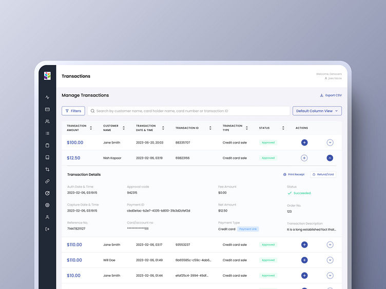
We bought a unique idea of a default column view to allow the user to simultaneously select no more than six columns for simplified data visualization. The rest of the columns could be viewed in an expanded view. We also introduced colors and appealing components to not only ensure exceptional data visualization but also light up the interface to engage and hook the user completely.
This flow was also integrated with the option of adding a new transaction. All you had to do was add personal information, address, card information, and charge details, and you're all set for it.
Enter your text here...Once a successful transaction was made, a pop-up modal alerted the user about the successful payment. It also gave the option to view the receipt.
Looking for decluttered UX tables like these?
Visit us!
Website | LinkedIn | Instagram | Contact us


