Dashboard UI components for the online banking platform
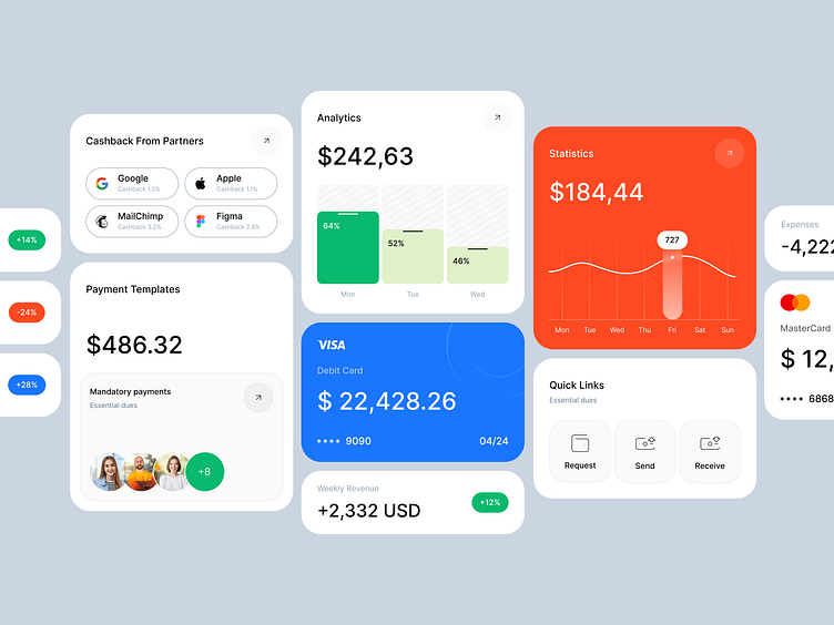
We are introducing you to a set of UI components aimed at enhancing the neobank user experience.
Our focus on clarity, functionality, and user-centric design has resulted in a dashboard that not only looks stunning but also empowers users to make informed financial decisions.
Key Features:
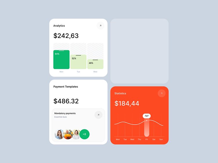
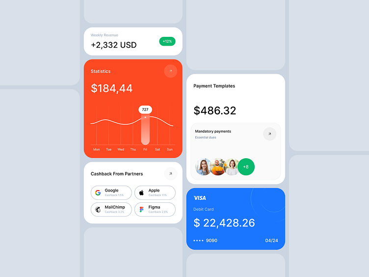
Intelligent Data Visualization: Dynamic charts and graphs transform complex financial data into easily digestible insights.
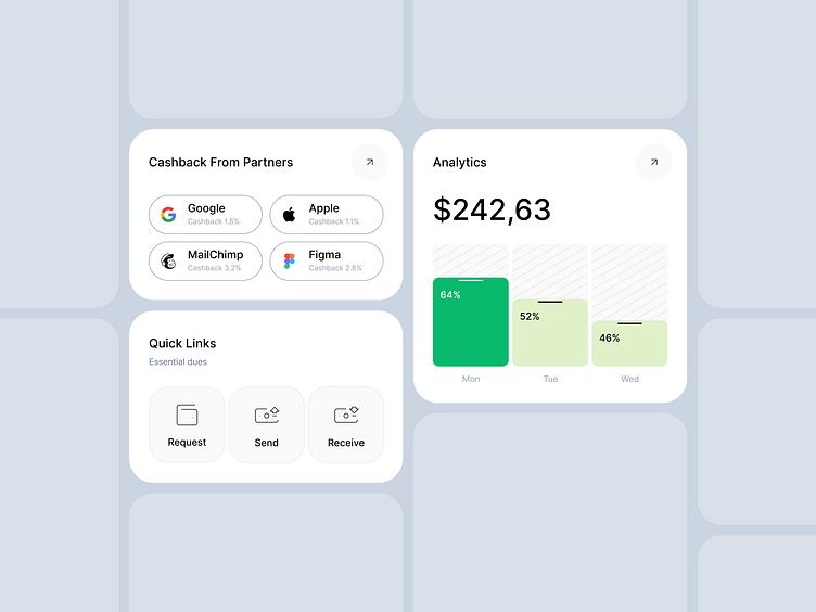
Intuitive Interaction: Smooth navigation and engaging elements enhance user experience.
Visual Hierarchy: Strategic use of color and space prioritizes essential information.
Accessibility Focus: Designed to accommodate users with diverse needs.
This dashboard is more than just a pretty interface; it's a powerful tool for financial management that helps users make the informed decisions. By combining aesthetics with functionality, we've created a design that is both visually appealing and highly effective.
hello@outcrowd.io
outcrowd.io
We ensure your brand image won't get lost in the market noise.
With design and branding, Outcrowd helps reveal your brand's essence and build products that attract users, impress investors, and drive breakthrough growth.
Become a part of Outcrowd communities: