Logo & Branding for Downloader App Lander™
Excited to have finished another logo and branding design project for Lander™, a top app for super-fast downloading. This project was a great team effort where my client’s ideas helped shape the final design.
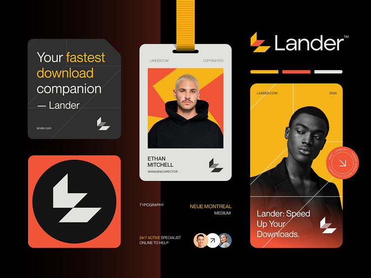
Together, we created a smooth and powerful logo that shows Lander’s focus on fast download speeds. The client was very happy with the result and felt the design truly captured the spirit of their brand.
Concept: Letter L + Down Arrow
Color Psychology: For a fast downloader app, orange can symbolize the power and urgency of quick downloads, while yellow represents optimism and a positive user experience. Together, they create a sense of excitement and reliability for the app.
Press "L" to show your love ❤️️
____________________________________________________________________
👉 Let's work together and elevate your brand!
📩 Available for new projects :
Email: info@rahidrehman.me
WhatsApp: https://wa.me/+8801705553455
Telegram: @rahiddesigner
💡 Follow for more update: Dribbble, Behance, Instagram, Twitter, Linkedin
© Rahid Rehman