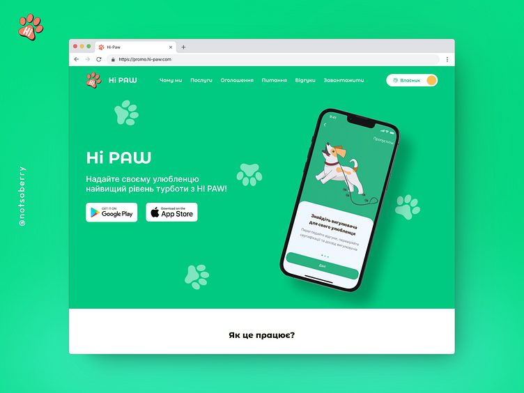
Hi PAW — Pet Care & Walking Landing Page (2023)
Meet Hi PAW — your ultimate companion for pet care and walking services, designed to make life easier for pet owners everywhere. This vibrant and user-friendly landing page delivers a seamless experience, combining playful visuals with intuitive navigation. From helping users understand how the app works to showcasing top-notch services, Hi PAW is built with pet parents in mind. Explore, connect, and give your pets the care they deserve, all in one sleek app!
By the way, you can check out the working site at this link — https://promo.hi-paw.com
Hero Section with Navigation Bar (on the cover)
Welcome to Hi PAW! The hero section instantly draws you in with a playful pet mascot, vibrant paw prints, and a sleek phone mockup showcasing the app. The top navigation is smooth and intuitive, guiding users effortlessly through the site. The prominent download buttons for both the App Store and Google Play invite users to start their pet care journey with a single tap.
How It Works?
Breaking down the process into five fun and easy steps, this section guides you from sign-up to enjoying premium pet care. Each step is accompanied by adorable icons, making it easy to understand how Hi PAW connects you with trusted pet walkers and sitters. Simplicity meets charm, ensuring users feel confident in the process.
Banner "Let’s Try"
Ready to dive in? This bold, energetic banner gives users a nudge with a clear call to action. Featuring a sleek smartphone mockup, it entices users to explore the app’s features and start their pet care journey with just a click. It’s all about making it easy and irresistible!
Why Us?
Why choose Hi PAW? This section showcases the app's standout benefits —verified professionals, quick response times, and secure services. Colorful icons and a clean layout make the advantages clear, building trust and showing why Hi PAW is the go-to choice for pet owners who want the best for their furry friends.
Our Services
Whether you're looking for reliable dog walking or a trustworthy pet sitter, Hi PAW’s got you covered! This section highlights the app’s core services with vibrant, eye-catching cards. Each service is presented with a short summary and inviting visuals, making it easy for users to choose what’s best for their pets.
Advertisements
Discover more with Hi PAW’s advertisements section! This block showcases special offers and important announcements in a card-based format, allowing users to browse services, see what’s trending, and connect with local pet professionals. Quick, easy, and right at your fingertips!
FAQ
Got questions? The FAQ section has answers! With a sleek, accordion-style design, users can quickly find the information they need without being overwhelmed. It’s all about making sure users feel informed and ready to dive into the Hi PAW experience.
Reviews from Pet Owners
Nothing builds trust like real stories from happy pet owners. This block features authentic reviews in a dynamic slider format, complete with photos and testimonials. Users can see how Hi PAW has made a difference for fellow pet parents, adding a personal touch that resonates.
Banner with Short Slogan about App
A quick, catchy slogan paired with another irresistible call to action makes this banner a powerful closer. Bright and on-brand, it reinforces Hi PAW’s mission to simplify pet care while reminding users to download the app for all their pet care needs.
Full Landing page
Start your pet care journey today with Hi PAW — where every paw is treated with love! 🐕💚
This is a design created as part of a university internship for VRG Soft in 2023.


