Countdown Timer #DailyUI #014
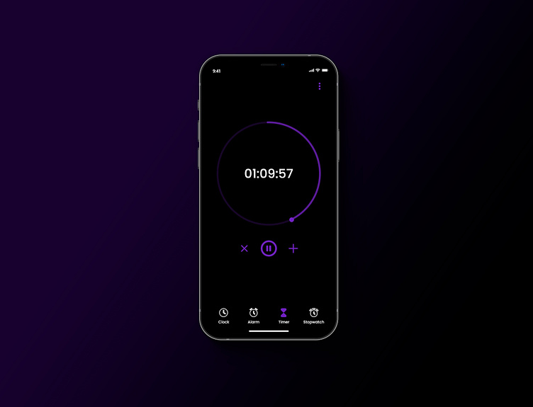
A timer application interface with a modern and minimalistic design. Here’s a breakdown of the design elements:
General Theme:
The interface uses a dark mode theme with a black background, which is easy on the eyes and creates a sleek look. The purple and white color scheme contrasts well with the black background, making the elements easily distinguishable.
Time Selection: The time selection interface is divided into three columns, representing hours, minutes, and seconds. The numbers are displayed in a white font, with the selected time (2 hours, 30 minutes) highlighted in a slightly brighter white, making it stand out.
Play Button: The play button at the center is purple, adding a pop of color to the otherwise monochrome interface. It is circular with a play icon in the center, inviting the user to start the timer.
Navigation Icons: At the bottom of the screen, there are four navigation icons (Clock, Alarm, Timer, Stopwatch), with the Timer icon highlighted in purple, indicating that this is the active screen.
Active Timer: The timer interface shows a countdown timer in progress (01:09:57). The timer is displayed prominently in the center with a white font, and the circular progress bar around it is in purple, showing the remaining time visually.
Control Buttons: Below the timer, there are three control buttons: a cancel button (X), a pause button (||), and an add time button (+), all in purple. These buttons allow the user to manage the timer easily.
Minimalist Dots: There are three vertical dots at the top right, which likely open a menu for additional options. This is a standard design element for accessing more settings.
For more work contact me on unnisabu123@gmail.com
#DailyUI

