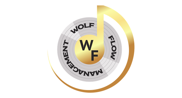
Wolf Flow Management
For this logo, the client was looking to redesign their logo into something that better represents Wolf Flow Management.
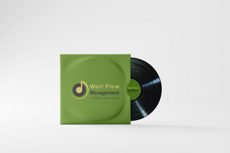
For the mock-up, I decided to go with a vinyl cover to fit with the style of the logo and the brand. I decided to change the color up so the cover stood out in the background more. As a result, it has a nice look to it.

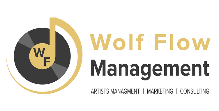
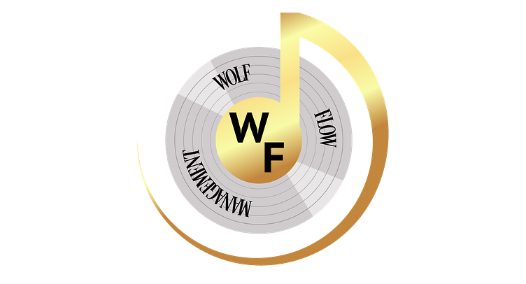
Originally this was what Wolf Flow's logo looked like. The client felt that this logo had several issues with the layout and felt the vinyl record with the music note needed some reworking as well. They felt that its shape wasn't right, as it was more oval-shaped than circular.
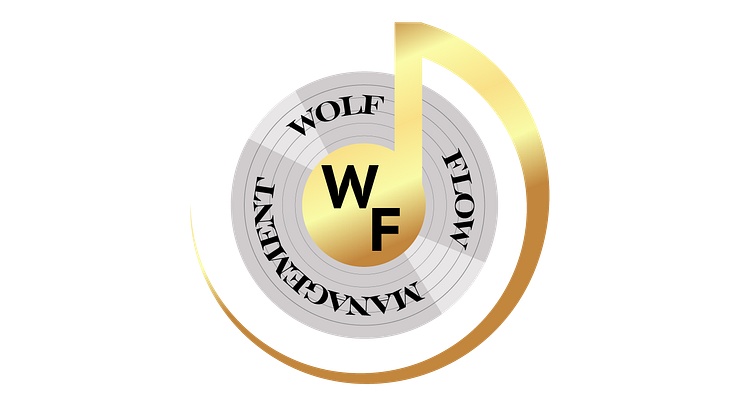
The client suggested that I use the vinyl and music note as part of the logo, and to also change up the colors a bit. I ended up using this YouTube banner Wolf Flow had as an idea of my color choices.

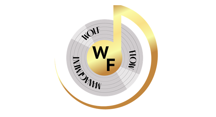


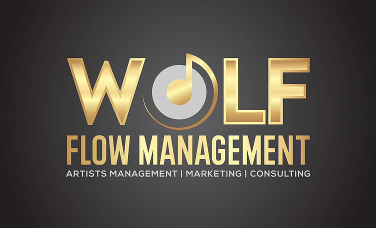
There were many attempts to recreate the Wolf Flow logo, but there were some major issues with them. The client found these to be too over-designed, with some of the text being hard to read in a circular manner like that.

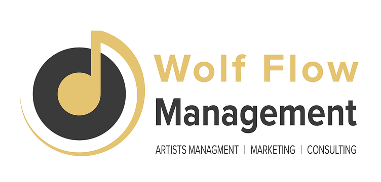
After many attempts at recreating the Wolf Flow logo, I decided to take notes on the original design and reworked some of the text placement, in addition to using the colors from the YouTube banner. As a result, the logo came out well, and the client was satisfied.
