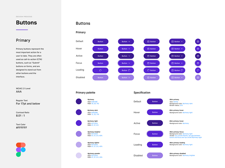
Style guide with Figma: Primary buttons
Primary buttons represent the most important action for a user to take. They are often used as call-to-action (CTA) buttons, such as "Submit" buttons on forms, and are designed to stand out from other buttons and the interface.
Please share your feedback! ____
Do you need some help? Feel free to reach out!
More by Renato Mattos View profile
Like
