VOYAGER - Brand Guidelines for the transportation company
Hello everyone!
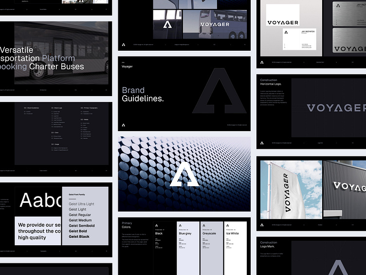
We’re excited to introduce the bold new branding we developed for VOYAGER—a brand where simplicity meets intensity.
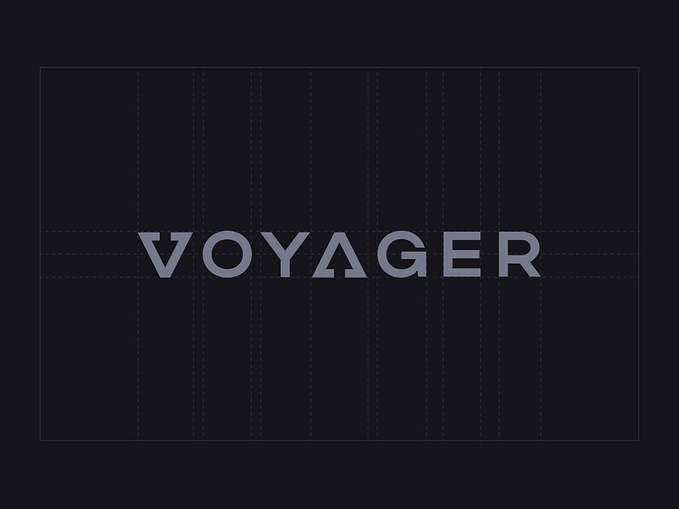
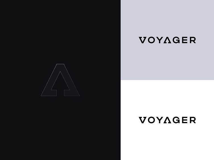
The logo is one that speaks volumes. Aggressive yet minimalist, it strips away everything superfluous to leave only the essentials: a name that draws attention and a design that is unmistakably VOYAGER.
Here’s what we focused on:
▪️ Aggressive Minimalism: The logo features strong, clean lines that convey both power and simplicity, ensuring the brand stands out with a clear, bold identity
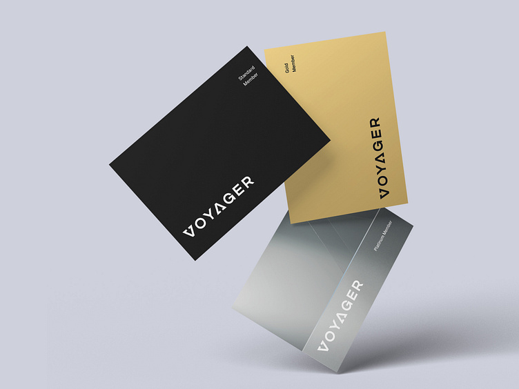
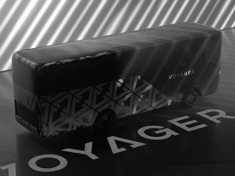
▪️ Monochrome Impact: The black-and-white palette isn’t just a choice; it’s a statement. It reinforces the brand’s no-nonsense approach while remaining versatile across all platforms
▪️ Typography with Attitude: Every letter in the logo is crafted with precision, exuding confidence and a modern edge that resonates with today’s explorers
VOYAGER’s new identity isn’t just a logo—it’s a symbol of the journey ahead.
Check out the new look in action at: https://govoyager.com