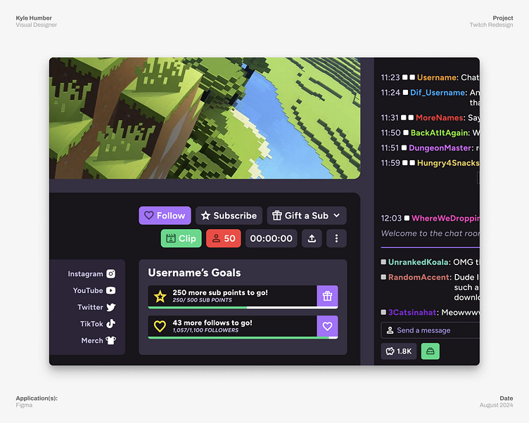
Twtich Redesign: Unified Details
Twitch's main stream page when you are watching a stream has A LOT of information going on that is all essential and can't really be tucked away behind menus without causing confusion. In addition to giving each main section their own space by floating them, I unified the various interactive elements. Some things were in boxes, others just text and icons hanging about, and it isn't even properly aligned with the rest of the UI! I had to save it.
Now with my vision in place, each element is housed in the same relative sized rectangle and reordered to put the highlighted info together. Much better!
More by Kyle Humber View profile
Like

