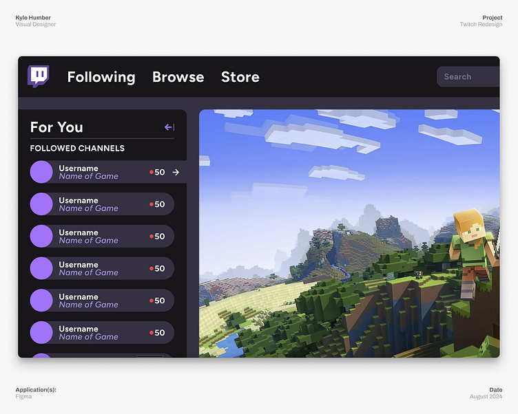
Twitch Redesign: New Menu
I redesigned twitch's UI where it needed the most love–here I updated the main menu, moving the messy and overly complex dropdown menu with not commonly used options off to the far right and opted for a 'Store' option instead. Right now, Twitch does not have clear navigation to a unified storefront, and it only makes sense to have the option front and center to drive sales for subscriptions, bits and more.
More by Kyle Humber View profile
Like
