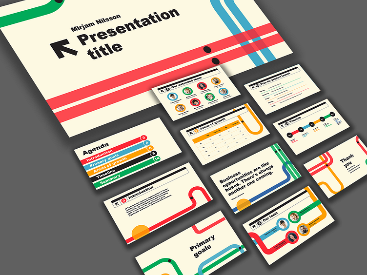
Microsoft Office | Metropolitan Presentation
Microsoft PowerPoint template made with a Metropolitan brief in mind. The bulk of design choices made, from the Helvetica-like font to the colors and use of organic lines, pay homage by Massimo Vignelli's historic rebranding of NYC's subway system. I was further inspired to integrate Vignelli's dot-to-dot concept and way-finding rules throughout the presentation's headers, page numbers, and charts. I hope this play on perhaps one of New York's most iconic visual systems brings some fun to PowerPoint users and public transit fans alike. This is an Accessible template. Programs used: Microsoft PowerPoint
Want to learn more design history? Here's a quick read about Vignelli's system.
More by Sara Wang View profile
Like


