Logo & Brand Identity Design - Editing Machine
Editing Machine are a leading video editing company that provides a comprehensive range of services aimed at content creators, particularly YouTubers, who seek to outsource and automate their entire content production workflow. Following an extensive brand strategy session, the brand positions itself as a tech-forward and AI-driven solution. The company distinguishes itself by leveraging new technologies and collaborative team structures to deliver more efficient, systemised and professional results.
Editing Machine’s overarching ambition is to provide an unparalleled level of automation: streamlining the video production process to a degree that has not yet been achieved in the industry.
The branding project aimed to instil trust in the efficiency and systemisation that Editing Machine offers. The brand experience was crafted to convey a message of technological superiority, ensuring that users feel they are part of a streamlined, automated process that saves time and enhances productivity, enabling brand loyalty amongst customers.
The visual identity looks to convey a sense of technological advancement, particularly via automation, to create an easy, efficient and competitive source for video editing.
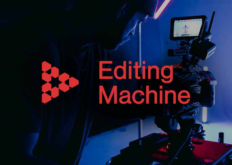
The approach for the brand icon, consisting of geometric shapes forms a triangle, that links to YouTube’s brand icon. The central star signifies a customer-centric business and promotes a sense of trust and professionalism. The star icon associates the brand with excellence, capability and high-standards. The main triangle shape suggests seamless automation, accessibility, ease-of-use and speed.
The brand strategy included the development of new sub-brands, each targeting specific segments such as early-stage creators, businesses and video editors themselves through a specialised Academy. Sub-brands are categorised by individual colours, with the sub-brand’s wordmark paired with the main brand to maintain recognition.
A shade of pure red injects a bold sense of energy to the brand that makes a statement – similar to the intentions of content creators. Once again, this shade of red links to the core red of YouTube. Contrasting dark backgrounds with subtle gradients add a sense of depth and energy, whilst connecting with innovation and tech brands.
The icon extends to form the brand pattern, commonly at large scales and cropped within compositions, in a linear display. This method increases familiarity with the brand, given that the logo is one of the most memorable features of a brand. Incorporating this geometric pattern evokes a modern and tech-savvy aesthetic, aligning with automation.
Neue Haas Grotesk is the chosen headline and body copy typeface. Unconventionally positioned bold type appeals to younger, creative users, with subtle applications of outlined text to highlight key messages without compromising readability.
The brand development of Editing Machine was a comprehensive effort to establish itself as a dominant force in the video editing industry. By focusing on technology, efficiency and a customer-centric approach, the brand is well-positioned to achieve its vision of becoming a global leader in content production.


