Product & Brand Web3 Launchpad
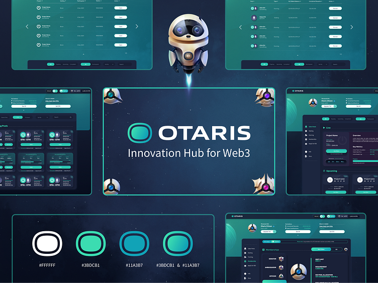
I worked on Otaris as part of the Faculty Group, where I led a team of designers, managed development efforts, and facilitated communication between the business development team and the rest of the project. I served as both a Product Designer and SCRUM Master, working alongside my colleague, who was the Product Owner. The beautiful branding and custom 3D graphics were created by our talented design team, which included Oleksiy Yuzik, Aivaras Dvilinskas and me.
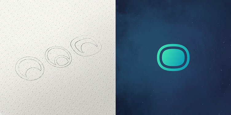
Symbol design process
We started with several logo sketches and narrowed them down to three final variants. As you can see on the right, the final logo differs slightly from the sketches. We refined it by combining elements from all three variants to create the final design.
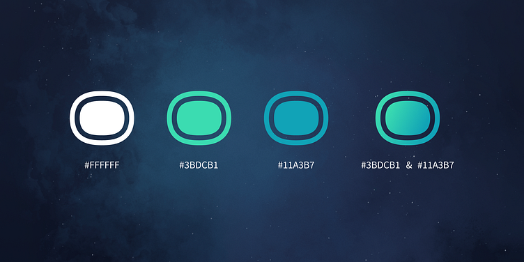
Brand colors
We chose colors that symbolize growth and success. As a launchpad, Otaris supports projects expected to increase in value, making green the primary color. Green represents profits and aligns with the green candles commonly associated with the web3 space. The background, depicting a galaxy, reflects the popular crypto meme of "going to the moon and beyond."
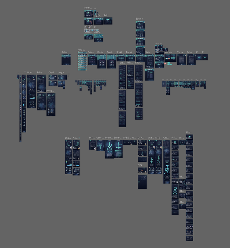
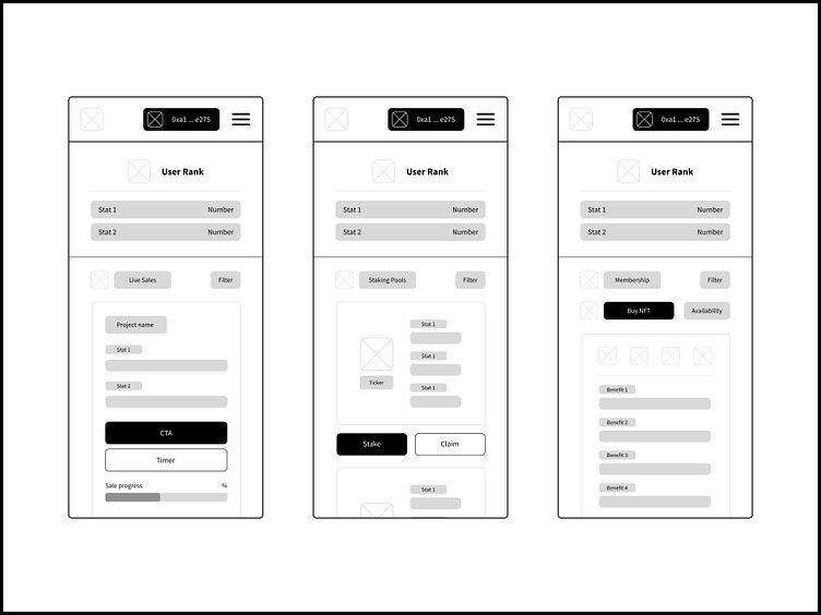
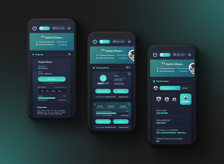
MVP Low Fidelity to High Fidelity Wireframes
After several brainstorming sessions with the team, we sketched an MVP product to start designing and developing. This quickly led to a flood of new feature ideas, some of which we implemented, while others were scrapped.
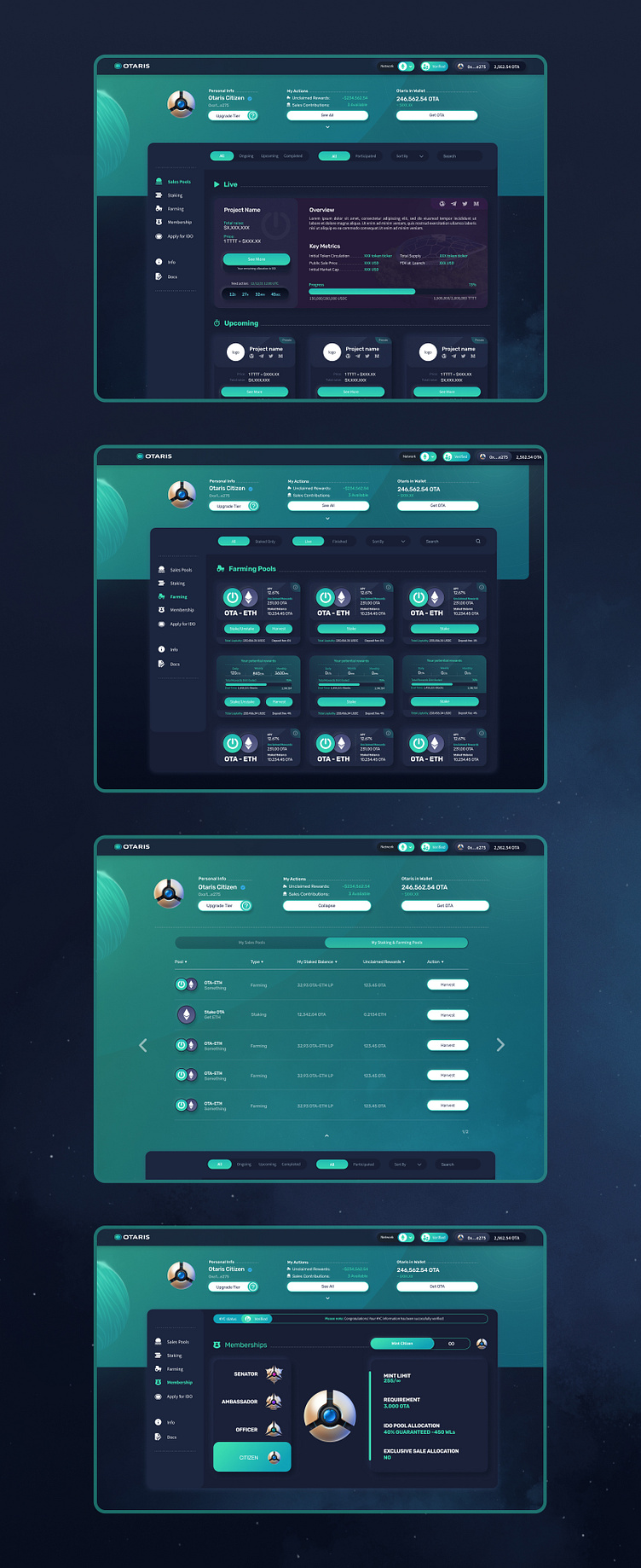
Figma File
This was one of my largest projects to date, taking nearly two years to build. Although the product didn't launch in the form shown here, it is now operational, helping startups in the web3 space gain visibility and succeed.