26/32 – Wichita Flyers
The Air Capital
Our 26th team for project is the Wichita Flyers, who play in the Central Division of the East Conference.
The Flyers, a team who has experienced their fair share of forgettable seasons, is often remembered for the greatest two-season turnaround in league history. After an 0-16 campaign in season 10, Wichita made an 11-game improvement and captured the Central Division title in season 11. Known as the "Zero to Hero" season, this mantra has given the franchise reason to believe that even the most disappointing seasons can become a step towards success. In season 26, the Flyers again captured the division title – this time with an 8-8 record – and have built one of the more talented young rosters in the league.


Visual Direction
The Wichita Flyers began play as the Topeka Indians before opting for a more modern teamname in the early 2010s. The common thread between the two eras has been the Victoria green and black color scheme, with the tertiary color evolving from a tan to a seafoam silver.
The teamname "Flyers" originates from Wichita's moniker as the "Air Capital of the World", an industrial hub of commercial aircraft engineering that is traced back to the early 20th century.
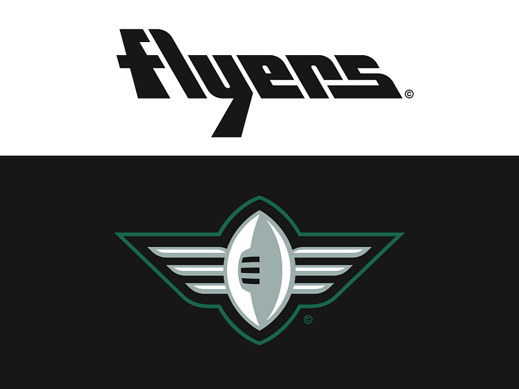
Execution
The Flyers' primary logo depicts pilot wings with a winged-W in seafoam silver contained with a thick black outline. The design of the "W" mimics the overall doubled-bowled construction of the "W" used in the Wichita city seal.
The secondary mark for the Flyers is a roundel spelling "Wichita Flyers Football" around the circumference of a 3-blade propellor engine. The central circular element with the three outer sections are a subtle nod to the Wichita city flag.
In the tertiary spot is a winged football, built with the same general structure of the primary, but with an alternate context. This mark is most notably used for coaches' sideline gear during games.
The Flyers' main typographic style is a modified version of Futura Display, a typeface that debuted in the 1930s around the same time as the emergence of Wichita's aviation industry. Both "Wichita" and "Flyers" wordmarks are designed in this style. An alternate "Flyers" backslanted script forming an aircraft silhouette of is also used throughout the identity.
The jersey number set for Wichita follows the same style as the team wordmarks but with modifications to better suit the proportions of the jersey top.
Zeroes to Heroes
The Wichita Flyers look to take off towards another playoff run with a refreshed visual identity powered by a robust graphic suite, hoping to provide the team with the lift it needs.
Football Helmet Mockup by SportsTemplates
____________________