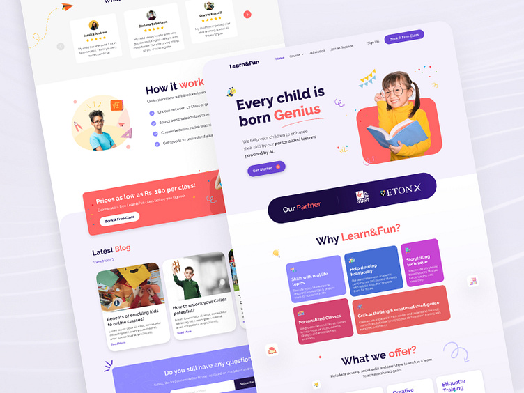
Learn&Fun Kids Education Landing Page Design
I'm thrilled to share my latest hypothetical project: a landing page for Learn&Fun, a kids' education website! This concept design features a subtle color palette with shades of purple as the primary color, creating a calming and engaging atmosphere perfect for young learners.
🔍 Key Highlights:
User-Friendly Layout: Designed with simplicity and clarity in mind, making navigation easy for both kids and parents.
Visual Appeal: Subtle color theme enhances the educational content without overwhelming the viewer.
Responsive Design: Optimized for various devices to ensure a seamless experience across platforms.
📩 Let's Collaborate! If you're interested in working together or have any freelance projects in mind, feel free to reach out. I'm always open to new opportunities and would love to help bring your vision to life!
Full page
📩 Let's Collaborate!
If you're interested in working together or have any freelance projects in mind, feel free to reach out on rautelamalvika18@gmail.com

