Medical Packaging Design
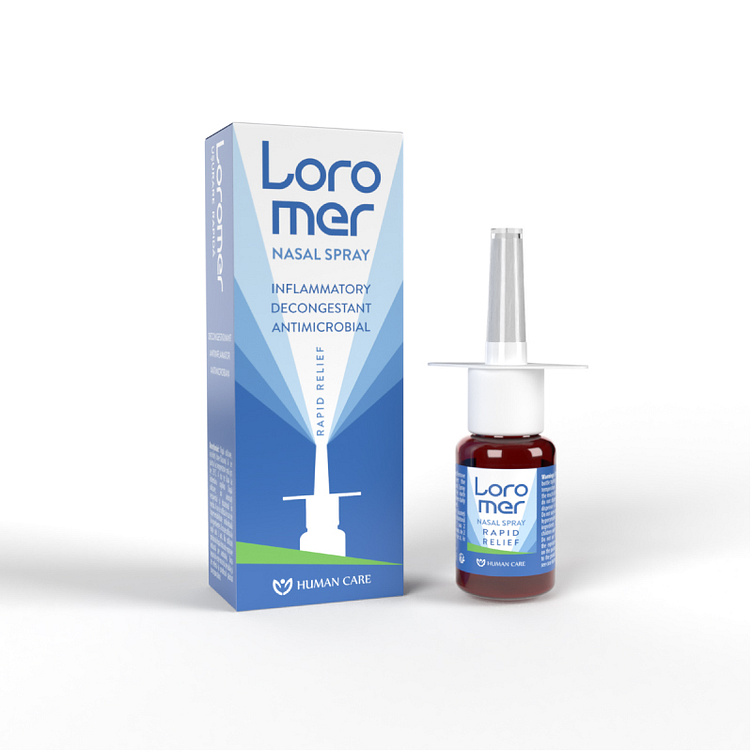
The Loromer Nasal Spray packaging project encompasses a sleek and modern design, emphasizing clarity, effectiveness, and brand identity.
Design Highlights:
Color Scheme: The primary color palette of cool blues and crisp white conveys a sense of calmness and cleanliness, aligning with the product's purpose of providing relief and soothing.
Typography: The bold and clear font used for the product name and features ensures easy readability. This choice helps communicate the essential information quickly and effectively.
Imagery and Icons: The front of the box features a dynamic graphic of a nasal spray silhouette, visually representing the product's use and target area.
Information Hierarchy: Key features of the nasal spray— "Inflammatory, Decongestant, Antimicrobial, Rapid Relief"— are prominently displayed, guiding the consumer's eye to the product's benefits.
Branding: The brand logo, "Human Care," is subtly positioned to enhance brand recognition without overpowering the overall design.
Packaging Shape and Size: The packaging is designed to be compact and user-friendly, reflecting the convenience of the nasal spray form factor.
This project effectively combines visual appeal with functional design, ensuring that Loromer Nasal Spray stands out on the shelves while providing all necessary information at a glance.
