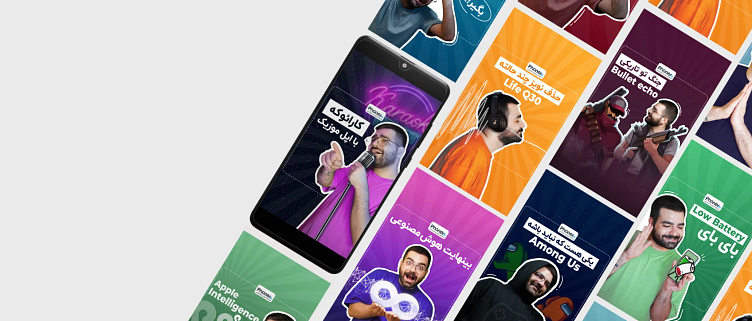
instagram reels cover style
For me cover designing is not just about the visuals, but also the storytelling and overall concept. It's like trying to juggle creativity and logic, but hey, that's part of fun!
"Phoner.ir" is an online store for mobile and accessories that shares interesting tricks on its instagram channel.
I decided to change the style of the instagram reels cover of this page to make it look more attractive.
I had also designed the old design of this page and it was attractive at the time, but with the passage of time and the change of people's tastes, it had to be changed!
Considering that we decided that all the design of this brand should follow the same style, and by examining different styles, finally, inspired by the Pop Art style, I created parametric patterns in the background that have the feeling of the Pop Art style, but are flatter and more minimal.
In some cases, I need to illustrate a part of cover to better convey the concept and story of the video.
Or even sometimes, because we couldn't take a real photo with the products, I would do creative things and add the product to the image in such a way that my colleagues were surprised. For example, for a video, we needed an image where the product should be on the character's ear, but we couldn't unbox the product and use it, so I stepped in.
I designed the cover you see by combining the photo of our character with another photo of a person using these headphone.
Here are some thumb-tastic designs that i have created.


