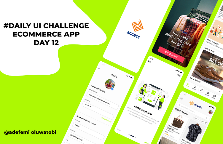
🌟 Day 12 of My 100-Day Daily UI Challenge! 🌟 ACCESS BANK ECOMM
Imagine if Access Bank needed an e-commerce platform to sell authentic international products from top brands like "Brands for Less" and "Light in the Box." How would such a platform look? What features would be essential to create a seamless shopping experience akin to platforms like Konga or Jumia?
In this design concept:
1. The interface is clean and intuitive, reflecting Access Bank's brand identity.
2. Users can easily explore a wide range of product categories.
3. The checkout process is streamlined with clear CTAs to boost conversions.
What do you think of this concept? What features or elements would you add to make it even better?
#DailyUI #DesignChallenge #EcommerceDesign #UIUXDesign #Day12
More by Adefemi Oluwatobi View profile
Like

