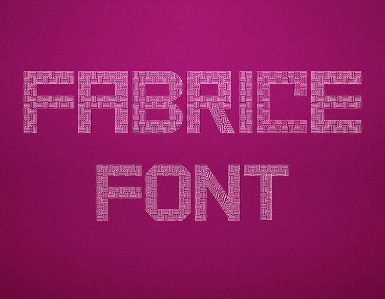
Fabrice Font
Gallery of Fabrice Font
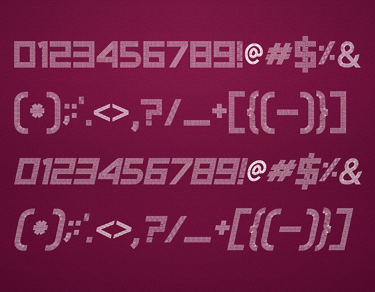

Making of Fabrice Font: A Designer's Perspective
The creation of Fabrice Font was a unique and intricate journey, one that allowed me to delve into the world of pattern-based typography. This font was designed with the intent to blend the richness of textile-inspired patterns with the precision and clarity of modern type design. The result is a distinctive font that stands out due to its detailed and textured appearance.
Concept and Inspiration
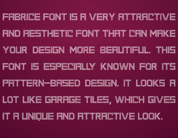
The inspiration for Fabrice Font came from the intricate patterns found in traditional fabrics and textiles. I wanted to capture the essence of these patterns and incorporate them into a font that could add a layer of texture and depth to any design. The challenge was to ensure that the pattern elements were seamlessly integrated into the characters without compromising their readability or aesthetic appeal.
Design Process
Conceptualization and Sketching: The process began with sketching out the basic letterforms and envisioning how different fabric-inspired patterns could be woven into the design. This phase was crucial for determining the overall look and feel of the font, ensuring that the patterns enhanced rather than overwhelmed the characters.
Pattern Design in Adobe Illustrator: After settling on the initial concept, I moved on to creating the intricate patterns that would define the font. Using Adobe Illustrator, I crafted various pattern designs, experimenting with different textures and motifs that would best represent the textile inspiration.
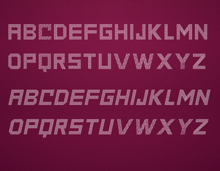
Integration of Patterns into Letterforms: The next step was to carefully integrate these patterns into the letterforms. This required a meticulous approach to ensure that each character was not only visually appealing but also legible. The patterns had to be balanced with the overall shape of the letters, maintaining a harmony between the decorative elements and the structure of the typeface.
Vector Refinement: Once the patterns were integrated, I refined the vector paths to ensure that the patterns were crisp and clear, even at smaller sizes. This involved fine-tuning the details of each character to achieve the right level of texture and intricacy.
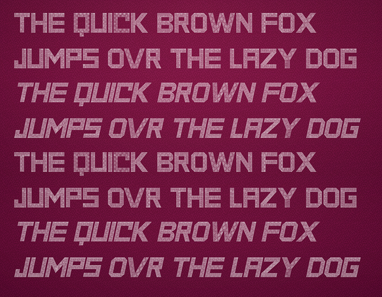
Kerning and Spacing: Proper kerning and spacing were essential to maintaining the readability of the font, given its detailed nature. I spent considerable time adjusting these elements to ensure that Fabrice Font would work well in various applications, from headlines to decorative text.
Testing and Iteration: The final stage involved testing the font in different design scenarios, gathering feedback, and making the necessary adjustments. This iterative process was key to ensuring that Fabrice Font met my vision of a textured, fabric-inspired typeface that could be used in a variety of creative projects.
Usage and Availability
Fabrice Font is available for free personal use. For commercial use, it can be obtained through Creative Fabrica. You can find it here or contact me directly at fontdesigner467@gmail.com for licensing information.
Creating Fabrice Font was a deeply rewarding experience, allowing me to combine the tactile beauty of textile patterns with the precision of digital typography. I hope this font brings a unique, textured touch to your projects and inspires your creative endeavors.
