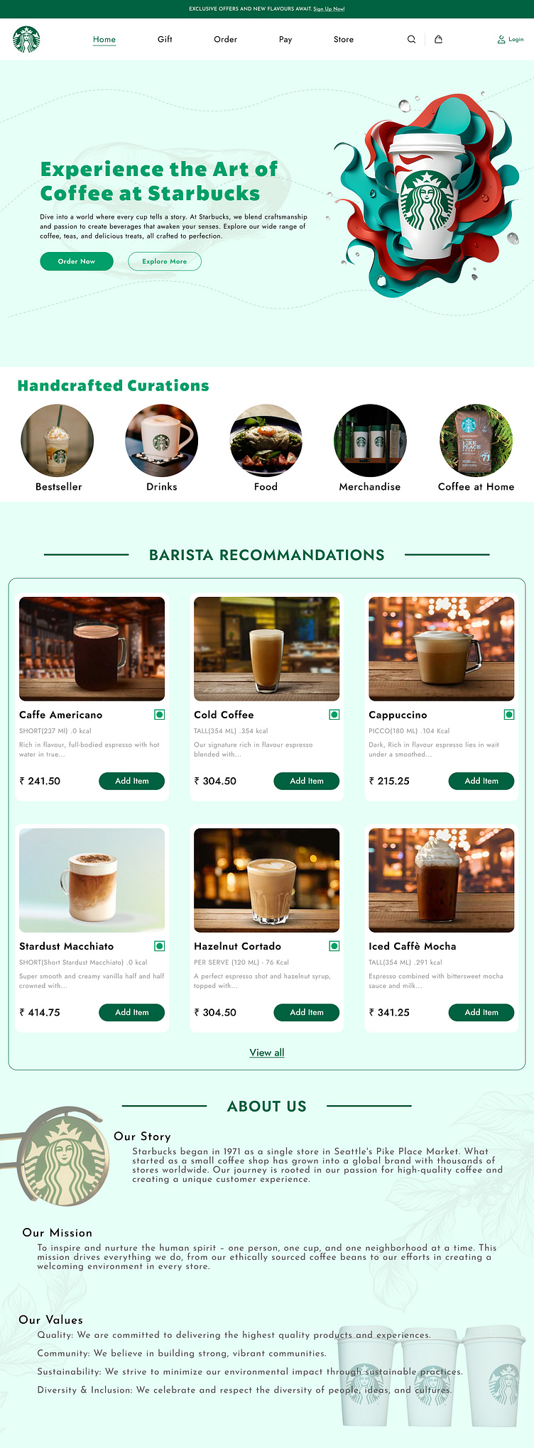
STARBUCKS Design Sprint - UI/UX Concept
Hi Everyone,
I’m excited to share a self-initiated design sprint project I recently completed for Starbucks. Using Figma, I focused on developing an intuitive and visually cohesive user experience that aligns with Starbucks' core values of quality, sustainability, and community.
This project was an opportunity for me to challenge myself and gain hands-on experience in creating a polished UI/UX design from concept to completion. Each design element was meticulously crafted, from the color palette and typography to the layout and interaction design, to ensure a seamless and engaging user journey.
Through this design sprint, I aimed to enhance the digital experience for Starbucks customers, making it easier and more enjoyable to explore their offerings. I’m proud to present the final result and would greatly appreciate any feedback or insights from the design community.
Thank you for taking the time to view my work!

