From Concept to Icon

The Hidden Flaw in Local Branding
When I first began the design process for "Oh 9!", a dessert shop in Kuwait City, I discovered something unexpected: 90% of dessert brands in the area were using outdated and overly complex logos. This revelation challenged me to think outside the box, aiming to create something both fresh and modern while retaining a playful appeal that resonates with the target audience.
Crafting 'Oh 9!
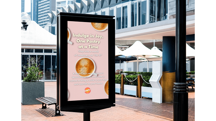
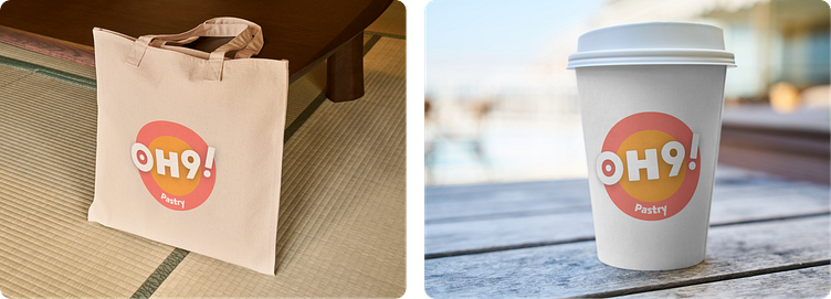
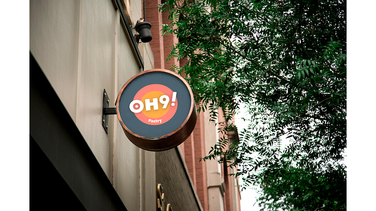
My journey began with in-depth market research, analyzing both local and global competitors to grasp current trends and consumer preferences. It quickly became evident that "Oh 9!" needed a brand identity that stood out through simplicity and memorability.I selected a vibrant color palette to convey the warmth and joy of indulging in desserts. The bold, circular logo symbolizes completeness, much like the satisfaction of a perfect pastry. The playful typography, especially the exclamation mark, was designed to evoke excitement and curiosity, inviting customers to explore "Oh 9!".The "Oh 9!" logo was crafted not just for aesthetics, but to align with the brand’s mission. The aim was to make it instantly recognizable and memorable, ensuring it would become a lasting symbol of the shop. I also ensured its scalability, maintaining its effectiveness whether on a large storefront sign or small packaging materials —crucial for a consistent visual presence across various touchpoints.