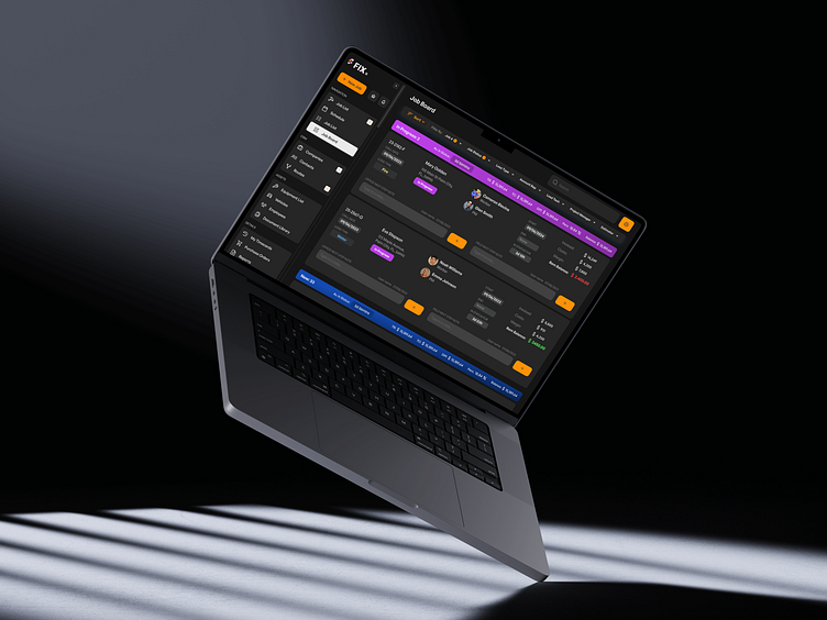
ERP Dashboard UX/UI Design: Enterprise Management
Project Overview:
This project showcases a modern and intuitive dashboard UI design for an Enterprise Resource Planning (ERP) system. The dashboard is designed to provide business leaders with a comprehensive view of their organization’s performance metrics, including finance, operations, and human resources. The aim is to streamline workflows, enhance data visibility, and improve decision-making processes.
Key Features:
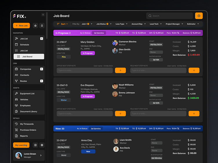
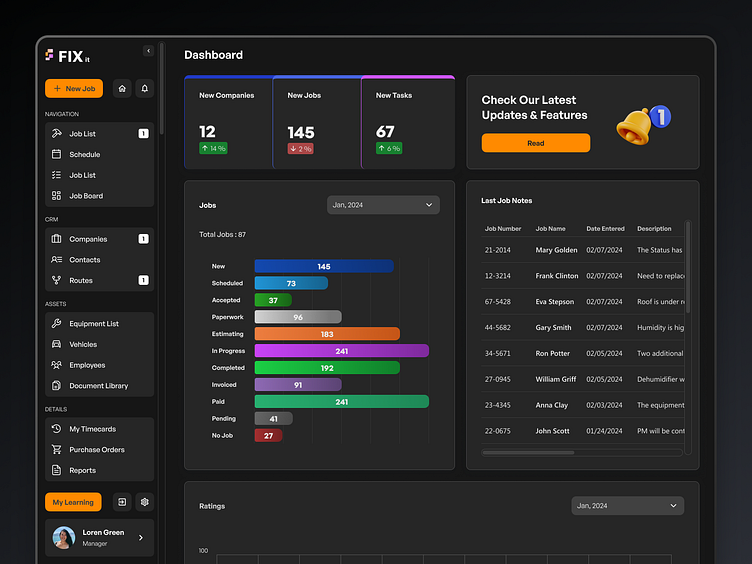
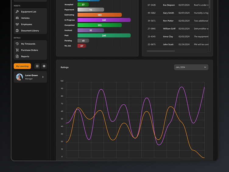
Data Visualization: The dashboard includes interactive charts and graphs that present complex data in a user-friendly manner, making it easier to track key performance indicators (KPIs).
Customizable Layout: Users can personalize their dashboard view by arranging widgets according to their needs, allowing for a more tailored experience.
Responsive Design: The UI is fully responsive, ensuring a seamless experience across desktops, tablets, and mobile devices.
User-Centric Navigation: The navigation is designed with simplicity in mind, allowing users to access essential features quickly and efficiently.
Dark Mode: A dark mode option is available to reduce eye strain during extended use and improve focus on key data points.
Challenges Overcome: One of the key challenges was ensuring that the dashboard remained uncluttered despite the vast amount of data it needed to display. This was achieved through strategic use of whitespace, grouping related elements together, and providing filtering options to users.
