RB Pitch
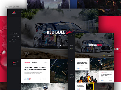
Howdy Ya'll! So yeah I know I know another Red Bull thing, but this kind of came full circle with me. Last year I did a typical designer re-design for what I imagined Red Bull's landing page would look like in my eyes.
Well a few months after I was approached by the wonderful people over at the INSTRUMENT Agency to bring to life a pitch they were conducting for Red Bull as part of a separate project.
The main thought here was to create a modular, easy to consume, and binge friendly UI. The fatty side bar is home to category change, main navigation and in spots, content sorting.
Anyways though, I dug how this turned out and figured it should see the light of day. Tickle the "L" for love! Don't forget to view the FULL PX. As always feedback is appreciated.

