Kreavo™ - Logo & Branding for Broadband Technology - K - Bolt
Thrilled to have completed another logo and branding design project for Kreavo™, a leading broadband technology company at Canada known for its dedication to quality and innovation. The process was a collaborative journey where my client's insights played a pivotal role in shaping the final concept. Together, we crafted a modern, robust logo that embodies Kreavo’s commitment to delivering cutting-edge solutions. The client was immensely pleased with the final result, expressing satisfaction with how the design perfectly captures the essence of their brand.
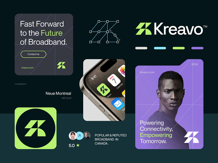
Concept: Letter K + Electric Bolt + Wifi Icon
Color Psychology: Green symbolizes growth and innovation, purple represents creativity and premium service, while light blue conveys trust and technology. Together, they reflect a broadband company’s commitment to reliable, forward-thinking solutions.
Press "L" to show your love ❤️️
____________________________________________________________________
👉 Let's work together and elevate your brand!
📩 Available for new projects :
Email: info@rahidrehman.me
WhatsApp: https://wa.me/+8801705553455
Telegram: @rahiddesigner
💡 Follow for more update: Dribbble, Behance, Instagram, Twitter, Linkedin
© Rahid Rehman