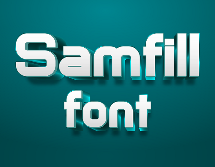
Samfill Font
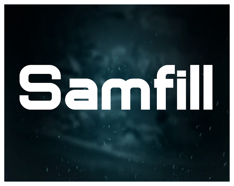
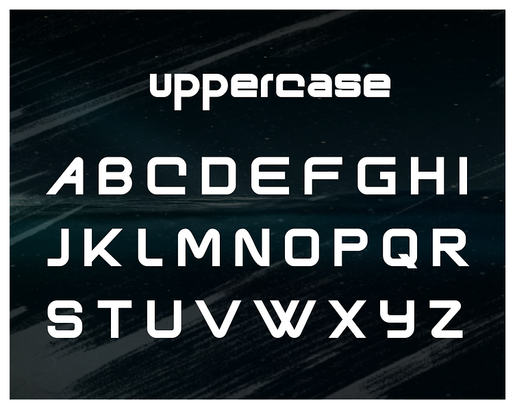
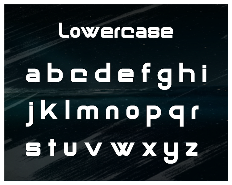
Gallery of Samfill Font
Making of Samfill Font: A Designer's Perspective
Creating the Samfill Font was an engaging design process focused on exploring the potential of filled letterforms combined with a clean, modern aesthetic. My aim was to develop a font that is both bold and versatile, suitable for a variety of design projects that require a strong, impactful typeface.
Concept and Inspiration
The idea for Samfill Font originated from the concept of using filled shapes to create solid, cohesive letterforms. I wanted to design a font that exudes confidence and clarity, with characters that are easy to read and visually striking, making it ideal for headlines, logos, and branding.
Design Process
Initial Conceptualization and Sketching: The process began with sketching out ideas for how the filled shapes could be effectively utilized in each character. This phase was crucial for experimenting with different weights and styles to achieve a balanced, cohesive look.
Digital Design in Adobe Illustrator: After refining the sketches, I transitioned to Adobe Illustrator to start digitizing the font. Illustrator’s vector tools were essential in creating the clean, filled letterforms that define Samfill Font, ensuring that each character was precise and well-structured.
Filling and Weight Balance: A key focus of Samfill Font is the balance between the filled areas and the overall weight of the font. I meticulously adjusted the fill and stroke of each character to create a uniform look while maintaining readability and visual appeal.
Vector Refinement: Once the basic forms were in place, I refined each character by fine-tuning the vector paths. This step involved ensuring that the filled areas were smooth and consistent, and that the characters maintained their structural integrity.
Kerning and Spacing: Proper kerning and spacing were critical to ensuring that Samfill Font remains easy to read, even at smaller sizes. I spent significant time adjusting these elements to make sure the font performs well in various contexts, from print to digital media.
Testing and Iteration: The final stage involved testing the font in different design scenarios and gathering feedback. This iterative process was vital for making final adjustments and ensuring that Samfill Font met my vision of a bold, versatile typeface.
Usage and Availability
Samfill Font is available for free personal use. For commercial use, it can be obtained through Creative Fabrica. You can find it here or contact me directly at fontdesigner467@gmail.com for licensing information.
Designing the Samfill Font was a rewarding experience that allowed me to explore new possibilities in typography. I hope this font brings a sense of boldness and clarity to your projects and serves as a powerful tool in your design arsenal.
