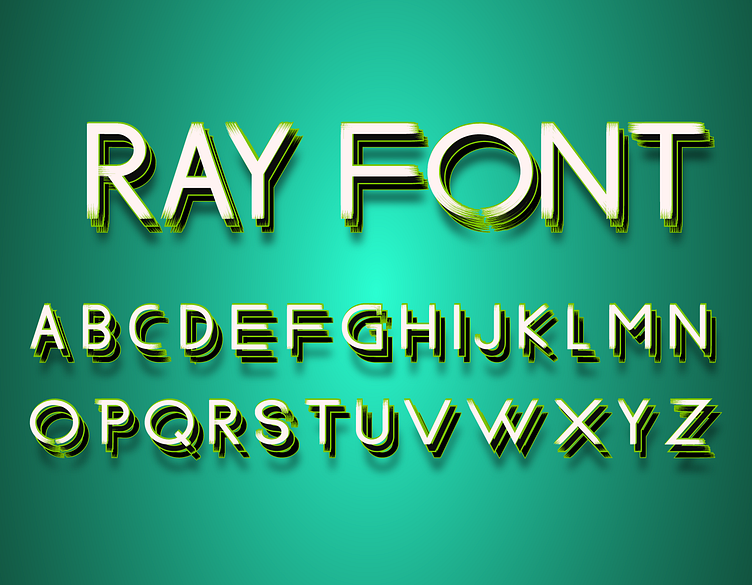
Ray Font
Gallery of Ray Font
Making of Ray Font: A Designer's Perspective
Designing Ray Font was a fascinating exploration of how light and shadow can influence typography. The idea was to create a font that embodies the concept of radiance, with each character designed to reflect the interplay of light, creating a dynamic and visually appealing effect.
Concept and Inspiration
The inspiration for Ray Font came from the natural play of light and shadow, which can dramatically alter the perception of shapes and forms. I wanted to capture this dynamic interaction in a font that could stand out in both digital and print formats, offering a unique aesthetic that’s both modern and versatile.
Design Process
Conceptualization and Sketching: The journey began with conceptual sketches, focusing on how light rays might influence the structure of each character. This phase was crucial for experimenting with the idea of incorporating elements that mimic the effect of light streaming through or across the letters.
Digital Design in Adobe Illustrator: After the initial sketches, I transitioned to Adobe Illustrator to bring the concept to life. Using Illustrator’s vector tools, I carefully crafted each character, paying special attention to how the lines and angles could be manipulated to suggest the presence of light.
Light and Shadow Detailing: A key feature of Ray Font is its emphasis on light and shadow within each letterform. I meticulously adjusted the thickness and angles of the strokes to create a sense of depth and dimension, making the letters appear as though they are being illuminated.
Vector Refinement: Once the basic forms were established, I refined each character by adjusting the vector paths. This step involved ensuring that the interplay of light and shadow was consistent across all characters, creating a harmonious and cohesive font.
Kerning and Spacing: Proper kerning and spacing were essential to maintaining the readability and visual balance of Ray Font. I spent considerable time fine-tuning these elements, ensuring that the font performs well in various sizes and applications, from headlines to body text.
Testing and Iteration: The final stage involved testing the font in different design scenarios and gathering feedback. This iterative process was crucial for making final adjustments and ensuring that Ray Font met my vision of a font that embodies the brilliance of light.
Usage and Availability
Ray Font is available for free personal use. For commercial use, it can be obtained through Creative Fabrica. You can find it here or contact me directly at fontdesigner467@gmail.com for licensing information.
Creating Ray Font was a rewarding experience that allowed me to explore new dimensions in font design, blending the elements of light and typography. I hope this font adds a unique touch to your projects and inspires new creative possibilities.


