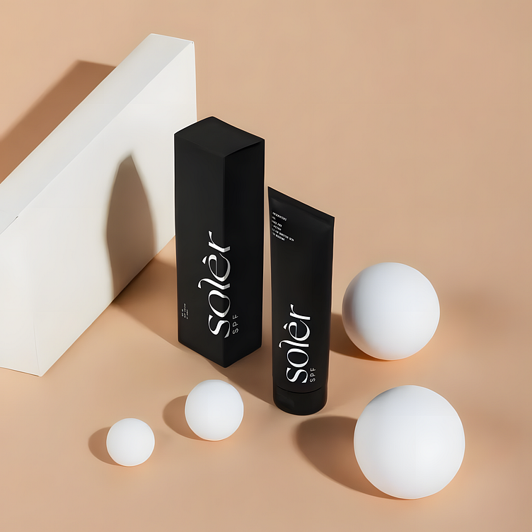
Minimal Elegance - Solèr SPF Product Post
This post design for Solèr SPF highlights the brand's commitment to minimalism and luxury. The composition is centered around the product, with a focus on clean lines and a muted color palette that exudes sophistication. The matte black packaging is juxtaposed against a soft, neutral background, making the product the hero of the design.
The use of white geometric shapes adds a modern, artistic flair, drawing attention to the sleekness of the product while maintaining a balanced aesthetic. This post was created to resonate with an audience that values both style and substance in their skincare choices, embodying the refined essence of Solèr SPF.
If you appreciate this style, feel free to connect with me for more creative designs like this one!

