EPFO, India — Design Improvements Based on Identified Issues.
The Employee Provident Fund (EPF) is a retirement benefits scheme where employees contribute a portion of their basic pay monthly, and employers match that contribution on their behalf. However, when attempting to transfer my EPF funds from my previous company to my current one, I found the website experience frustrating and unappealing. The registration process was particularly difficult as I struggled to find the appropriate link, and the overall design of the website was cluttered and poorly organized.
This experience made me understand why people may hesitate to trust government organizations when one of their most important websites is so lacking in user experience. Despite claiming to manage over 30 crore accounts, the website’s design and usability are far from satisfactory.
The goal is to enhance the overall user experience of the website by giving it a professional look. The primary objectives are to strengthen the design fundamentals and improve key web page elements.
Design Fundamentals:
1. Hierarchy
2. Color
3. Typography
4. Layout
5. Content
6. Overall aesthetics
Improve Key Web Page Elements:
1. Messaging
2. Visualization
3. Effective CTA’s
4. Information Architecture
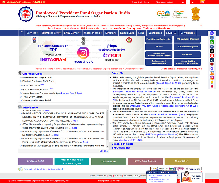
Before we begin, I’m sharing two screenshots of the existing website along with the ‘Identified Problems’ from my perspective as a user.
Existing Website:
Identified Problems:
Let’s discuss each point individually and work to find the best solutions based on my suggestions and the identified problems.
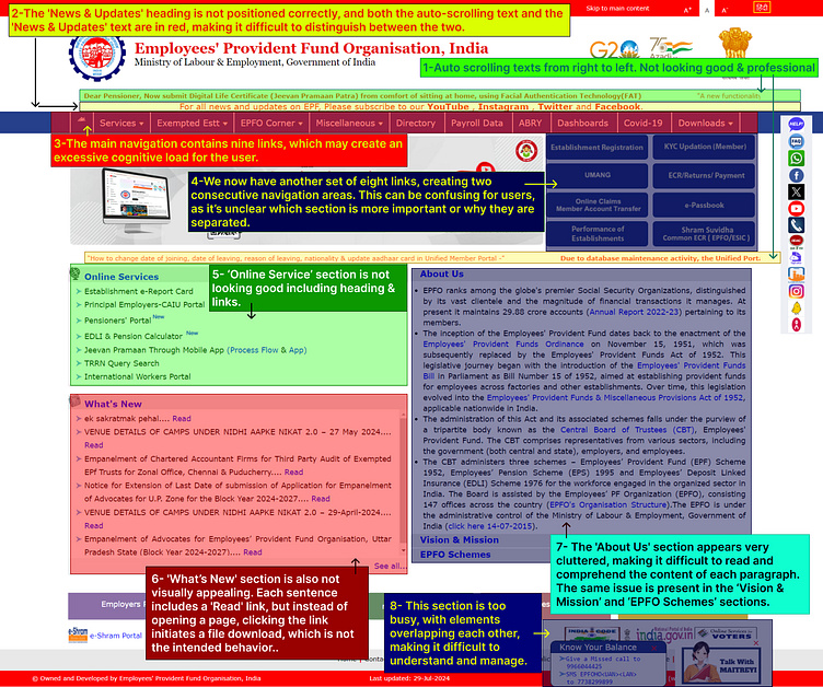
Point No. 1: Auto Scrolling Text section:-
Problem: While the red auto-scrolling text from right to left appears visually appealing, it becomes challenging to read when multiple important notices are displayed. Users may struggle to absorb the information as they have to wait for each message to finish scrolling individually.
Suggestion: To enhance readability, it would be more effective to display the two important pieces of information currently positioned separately on the website in a dedicated area. This approach would allow users to view and process the information more clearly and efficiently.
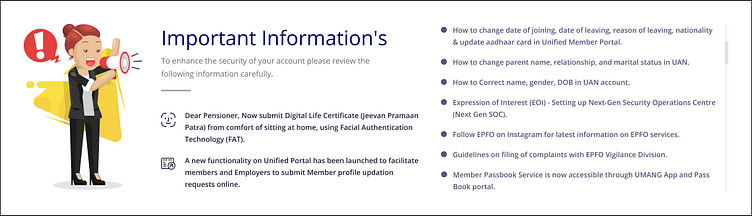
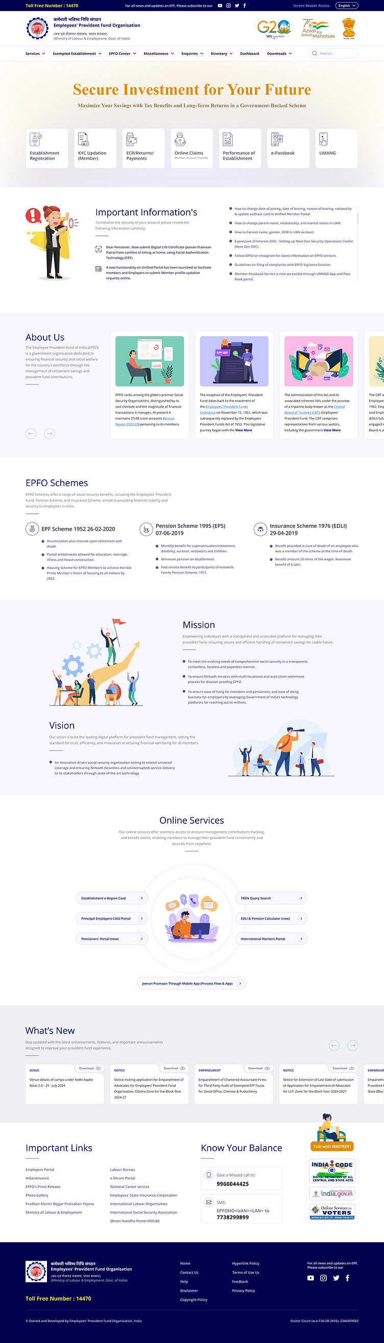
Final Output: Under the “Important Information” section, I have categorized the content as illustrated in the attached screenshot. The first two pieces of information on the left side pertain to newly launched features, which is why they are highlighted with icons and dark colors for greater emphasis. In contrast, the right section contains additional important notifications and guidelines related to account management. This section will feature a manual scrolling option to enhance the Customer Experience (CX) by making the interface more professional and intuitive.
Point No. 2: The News & Updates section:-
Problem: The heading is not positioned correctly, and both the auto-scrolling text and the ‘News & Updates’ text are in red, making it difficult to distinguish between the two.
Suggestion: Need to adjust the layout and consider using different colors to clarify that these are separate elements.
Final Output: Given the importance of subscription-related information, I decided to position it prominently at both the top and the footer of the page. At the top, I replaced the red background with the brand logo blue to ensure better alignment with the brand identity. Additionally, I centered the news and updated texts, incorporating relevant icons for improved visibility and user engagement.
Enter your text here...
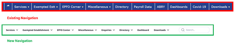
Point No. 3: Main Navigation section:-
Problem: The main navigation contains nine (9) links, which may create an excessive cognitive load for the user.
Suggestion: Consider reducing the number of links to simplify the navigation and improve the user experience.
Final Output: I maintained a streamlined approach by utilizing a clean white background and consolidating related links under a single “Enquiries” category. Additionally, I implemented a global search feature to enhance user experience and ensure users can easily find information at any time.
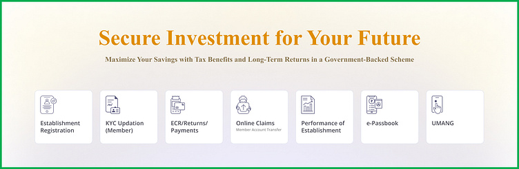
Point No. 4: Another set of 8 links section:-
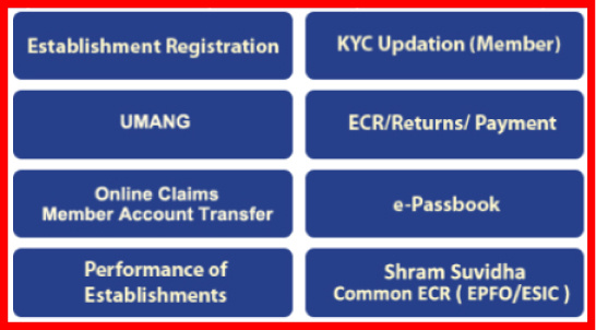
Problem: We now have another set of eight links, creating two consecutive navigation areas. This can be confusing for users, as it’s unclear which section is more important or why they are separated.
Suggestion: Need to clarify the purpose of these sections and consider consolidating them for a more streamlined navigation experience.
Final Output: I have highlighted seven unique links in the Hero Section, excluding “Shram Suvidha Common ECR (EPFO/ESIC)” as it is not a link. Instead of using a banner image, I propose incorporating these links directly into the hero area. They are arranged in a card format with individual link names and corresponding icons, supported by a clear heading and sub-heading. This approach is designed to offer a fresh and intuitive user experience, enabling users to easily and efficiently select the desired actions to achieve their goals.
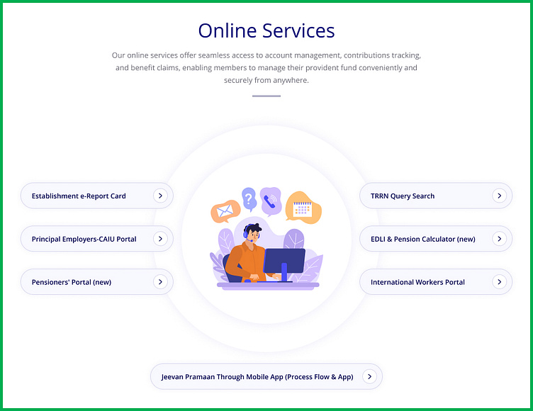
Point No. 5: Online Service section:-
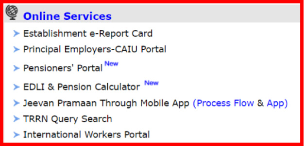
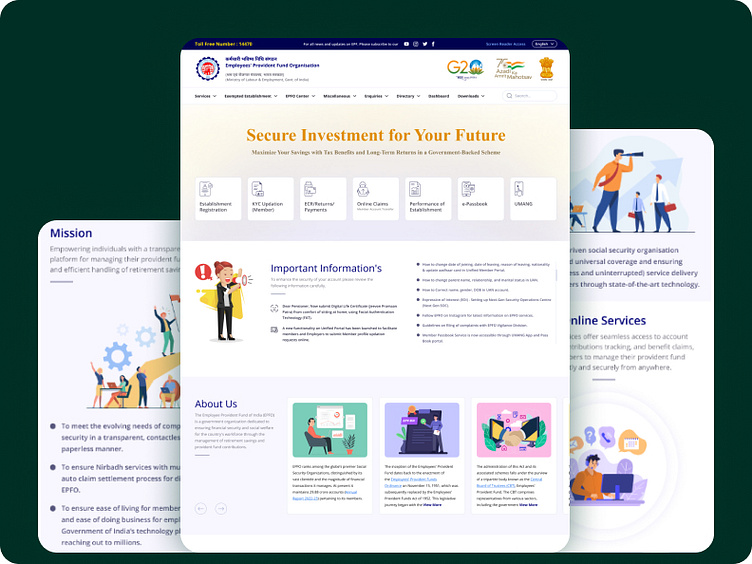
Problem: This section contains seven important clickable points that open separate pages in new tabs when selected. Currently, the heading does not appear visually appealing, and the items are not arranged properly. Additionally, without any interactive cues (such as mouse hover effects), it is not immediately apparent that these points are links leading to different pages. This needs to be addressed to improve clarity and usability.
Suggestion: “Online Services” is a crucial component of the website, on par with other key sections. To enhance its prominence, I propose improving the overall UI with a more effective UX strategy.
Final Output: To enhance the visual appeal and usability of the “Online Services” section, I have decided to center-align it. I have utilized an illustrative image in a double circular shape at the center to visually represent the section’s purpose. The links are arranged with three on the left, three on the right, and one at the bottom. The design of the links and their layout will indicate that they are individual clickable elements, providing users with a more intuitive and cohesive viewing experience.
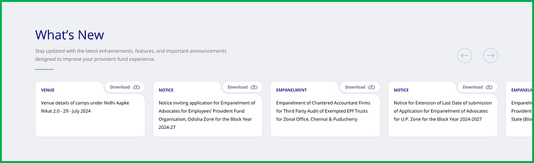
Point No. 6: What’s New section:-
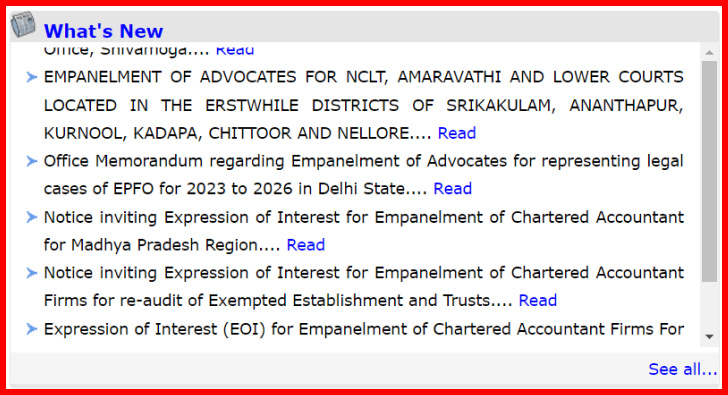
Problem: The ‘What’s New’ section is not visually appealing. Currently, each sentence includes a “Read” link that, when clicked, initiates a file download instead of directing users to the relevant content. This functionality is incorrect and needs to be corrected to ensure users are properly directed to the intended pages. Additionally, the text is too tightly spaced, making it difficult to read. Both issues need to be addressed to improve user experience.
Suggestion: This section requires improvement to communicate to users that all items are downloadable links. Currently, it should be made evident that clicking on each point or “Read” text will initiate the download of individual files. Additionally, increasing white space will enhance readability and provide a more comfortable reading experience for each paragraph.
Final Output: The card approach will offer a clear visual representation for users. To categorize each card, a small blue heading will be positioned in the top-left corner, with labels such as Venue, Notice, Empanelment, etc. This design will enhance usability by clearly indicating actionable areas for file downloads. The section will include horizontal scrolling, with previous and next circular buttons located to the right of the heading. Each click will reveal a set of four cards, improving navigation and accessibility.
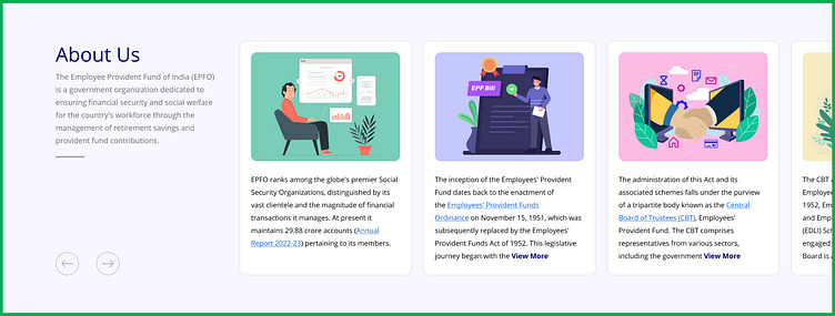
Point No. 7: About Us section:-
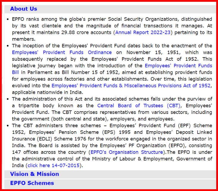
Problem: “The ‘About Us’ section appears very cluttered, making it difficult to read and comprehend the content of each paragraph. The same issues are present in the ‘Vision & Mission’ and ‘EPFO Schemes’ sections.
Suggestion: To enhance clarity and readability, these areas need to be reorganized. Introducing a card-based layout for the four points or paragraphs would provide a more structured presentation.
Final Output: As proposed, I have implemented a card layout for each paragraph to enhance differentiation, readability, and visual presentation. Each card features distinct illustrations with improved color contrast. The layout is designed to display up to 7 lines of text per card, with additional content accessible via a blue-bold “View More” link. Clicking “View More” will reveal a vertical scroll bar, allowing users to manually scroll through the complete text. Additionally, the Heading and Subheading will remain fixed on the left side of the paragraph, while the cards will scroll horizontally.
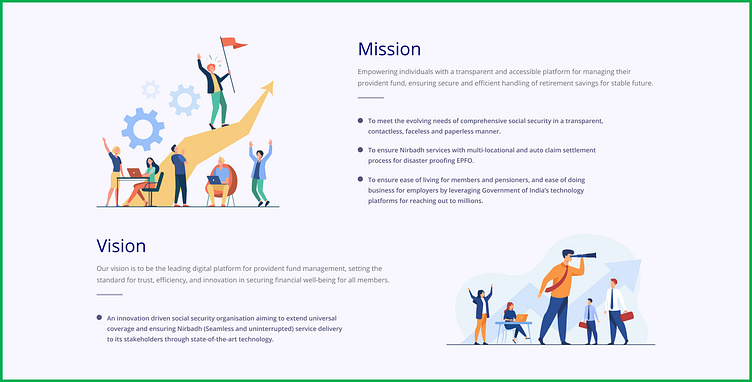
Mission & Vision Updated design:
I have decided to consolidate these two sections into a single section, as they are closely related. This unified section will be organized with clear headings, subheadings, and illustrative images to differentiate the content effectively. Each point within the sections will be highlighted using small circles and bold text. This approach is expected to enhance the overall design and improve user experience.
Point No. 8: Bottom section:-
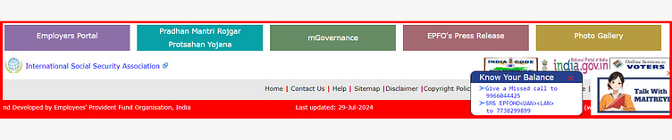
Problem: At the bottom of the Home page, the top five buttons with different colors do not align with the overall design aesthetics. Additionally, there is a set of links that auto-scroll vertically beneath the “Employee Portal” button, making it unclear whether these scrolling links are associated with that button. The right section is also overly cluttered, with overlapping elements that make it difficult to navigate and manage effectively.
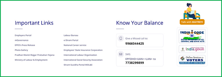
Suggestion: All buttons should have a consistent look and feel to maintain design harmony. The scrolling links should also have the option to be displayed upfront for better visibility. To encourage every employee to check their EPF balance, we need to highlight the “Know Your Balance” section using a clear and user-friendly approach. Additionally, the top three logos, representing different websites, should be properly aligned to create a cohesive visual experience, especially alongside the “Talk with MAITREYI” feature. This will ensure a well-organized and unified layout.
Final Output: I have grouped all the links under the “Important Links” heading for better organization. The “Know Your Balance” section has been highlighted as planned, using a card layout to differentiate the Phone and SMS options, complete with relevant icons, text, and phone numbers.
The three logos and the “Talk with MAITREYI” feature are now placed separately on the right side. To further emphasize the “Talk with MAITREYI” section, I used a distinct image. This section is designed to have a fixed position, ensuring it remains visible to users as they scroll through the page from top to bottom. service.
Wireframing:
Before creating high-fidelity screens, I developed two wireframes with different approaches.
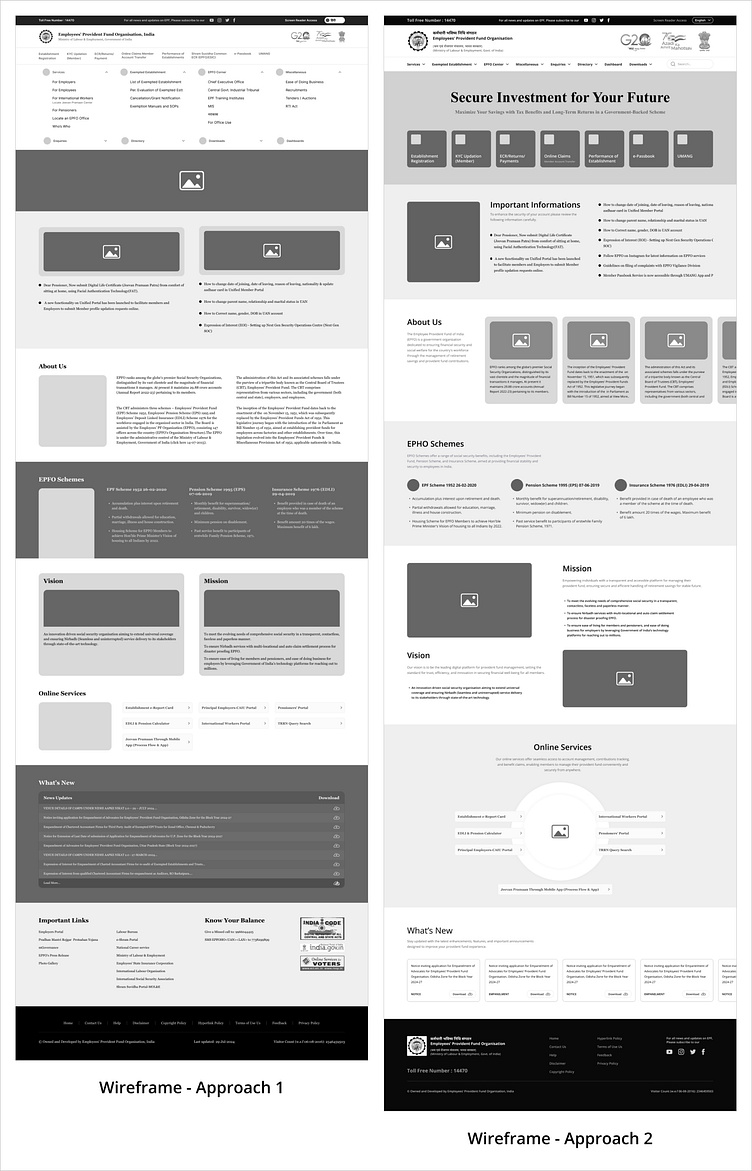
Wireframe Approach 1: The primary challenge was how to effectively display the seven additional important links immediately following the main navigation. Given the importance of both the main navigation and these links, I initially proposed placing them directly beneath the main navigation. However, this approach presents several issues:
Users might mistakenly perceive this section as a dropdown menu.
The abundance of links could create an unnecessary cognitive load for users.
Users may feel uncertain about which link to click first.
The Information Architecture for this navigation setup is not optimized for user experience.
In other sections, I have also created a first suggestions.
Wireframe Approach 2: In this second approach, I positioned all seven additional links within the Hero section. Instead of using a traditional hero image, I opted to feature these links prominently alongside headings and subheadings, creating a unique and functional Hero section. For the remaining sections, I incorporated design elements inspired by successful references from previous projects.
I have decided to proceed with the second approach in its entirety. While it presents a significant challenge, I am committed to bringing this vision to life and delivering a visually stunning and user-friendly experience.
I’m pleased to share the final and updated design, incorporating all the best suggestions and addressing the identified issues in each section. I believe this new design approach will be both helpful and intuitive for every user, enhancing their experience while navigating the website.
Heading
Mobile Design:

Mobile Screen recording: https://drive.google.com/file/d/1vaQKeVptCOhJd93Fanvsad1Cpu6nADRC/view?usp=drive_link
