Vista Cove Realty Brand Guidelines
1. Brand Overview
Mission Statement: Vista Cove Realty is committed to providing a secure, serene, and modern real estate experience. We aim to blend the natural beauty of landscapes with contemporary living to create ideal homes and investment opportunities.
Vision: To be the most trusted and innovative real estate brand, offering unparalleled service and solutions to our clients.
Core Values: Trust, Innovation, Excellence, and Client Satisfaction.
2. Logo Guidelines
Primary Logo:
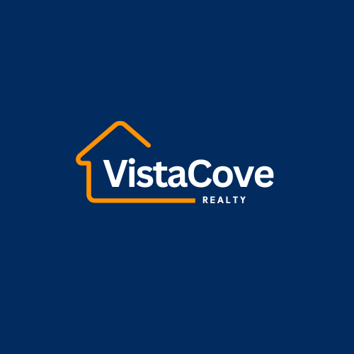
Description: The primary logo features the brand name "Vista Cove Realty" with a house-shaped outline that represents the warmth and security of a home. The logo is available in a blue and orange color scheme, symbolizing trust and creativity.
Usage: The primary logo should be used on all official documents, websites, and marketing materials. The blue background version is preferred for digital use, while the white background version is ideal for print materials.
Clear Space: Maintain a clear space around the logo, equivalent to the height of the letter "V" in "Vista," to ensure visibility and impact.
Minimum Size: The logo should not be used smaller than 1 inch in height or 72 pixels for digital formats to ensure readability.
Alternate Logos:
Black and White Versions: These versions are used in contexts where color printing is not possible or when a more subdued look is required. The black logo is suited for dark backgrounds, and the white logo is ideal for dark or complex backgrounds.
Usage: Use the black or white logo when the primary color versions may not provide enough contrast or when a more minimalistic design is desired.
3. Color Palette
Primary Colors:
Vista Blue: #002B5C – Used for the brand name "VistaCove" and as the primary color in the logo.
Sunset Orange: #F8971D – Used for the house outline in the logo, symbolizing warmth and creativity.
Secondary Colors:
Cove Grey: #7D7D7D – A neutral grey used for backgrounds and secondary text.
Ocean White: #FFFFFF – Used for backgrounds and to complement the primary colors.
Usage Guidelines: Use the primary colors in all branded materials. Secondary colors can be used for accents, backgrounds, and to add depth to designs.
4. Typography
Primary Typeface:
Font Name: Montserrat
Styles: Regular, Bold
Usage: Use Montserrat for all headings, titles, and major text in marketing materials, both digital and print.
Secondary Typeface:
Font Name: Open Sans
Styles: Regular, Italic
Usage: Use Open Sans for body text and any secondary information. It complements Montserrat by offering readability in longer text formats.
5. Imagery and Photography
Style: Imagery should reflect the harmony between nature and modern living, featuring serene landscapes, cozy homes, and modern architecture.
Mood: Photos should evoke a sense of trust, comfort, and luxury, aligning with the brand’s mission.
Color Treatment: Images should complement the brand’s color palette, with a focus on blues, greys, and warm tones. Avoid overly saturated colors that clash with the brand's primary colors.
6. Iconography and Graphics
Style: Icons should be simple, clean, and in line with the modern aesthetic of the brand. They should follow a line style that is consistent with the house outline in the logo.
Usage: Icons should be used sparingly to highlight key features and services on the website and in print materials. Ensure that icons are always aligned with the brand’s color scheme.
7. Tone of Voice
Brand Voice: Professional, approachable, and confident. The tone should reflect Vista Cove Realty’s expertise in the real estate industry.
Communication Style: Use clear and concise language, avoiding industry jargon unless necessary. The tone should be warm and inviting, making clients feel at home from the first interaction.
Messaging: Focus on the value and benefits the brand offers, such as security, serenity, and modern living. Emphasize trust and reliability in all communications.
8. Brand Applications
Business Cards:
Layout: Include the logo, contact information, and a subtle use of the primary color palette. The house outline can be used as a background element.
Letterhead:
Layout: Place the logo at the top of the page, with the contact information and address aligned at the bottom. Use the primary colors for headers and accents.
Signage:
Design: The signage should prominently feature the primary logo, with the background and accent colors consistent with the brand palette. Use the black or white logo versions where needed.
Digital Presence:
Website: The website design should use the brand colors and typography throughout, with a focus on creating a clean, user-friendly interface.
Social Media: Consistent use of the logo, color palette, and tone of voice across all social media platforms. Profile images and banners should reflect the brand’s identity.
9. Do’s and Don’ts
Do:
Always use the correct logo version.
Ensure consistency in color and typography.
Use high-quality, brand-aligned imagery.
Don’t:
Alter the logo’s proportions or colors.
Use non-brand fonts or colors.
Place the logo on clashing or overly complex backgrounds.


