Toggle Study
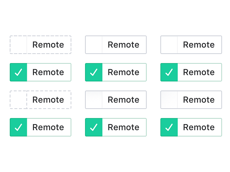
I like using native checkboxes as auxiliary options. When it comes to primary options (like deciding if you want remote workers or not in a search interface), I feel like users need a different control.
This is a study I did on the off state to make it obvious that it can be clicked to be toggled. I’ll probably go with the gradient option – 5th or 6th.
More by Pilot View profile
Like
