LOWKI | LOGO DESIGN & BRAND IDENTITY
Lowki Construction is a construction company with the mission of providing high-quality, safe and sustainable construction services and products. Lowki always focuses on ensuring that projects are completed on schedule, fully meeting technical standards and bringing maximum value to customers.
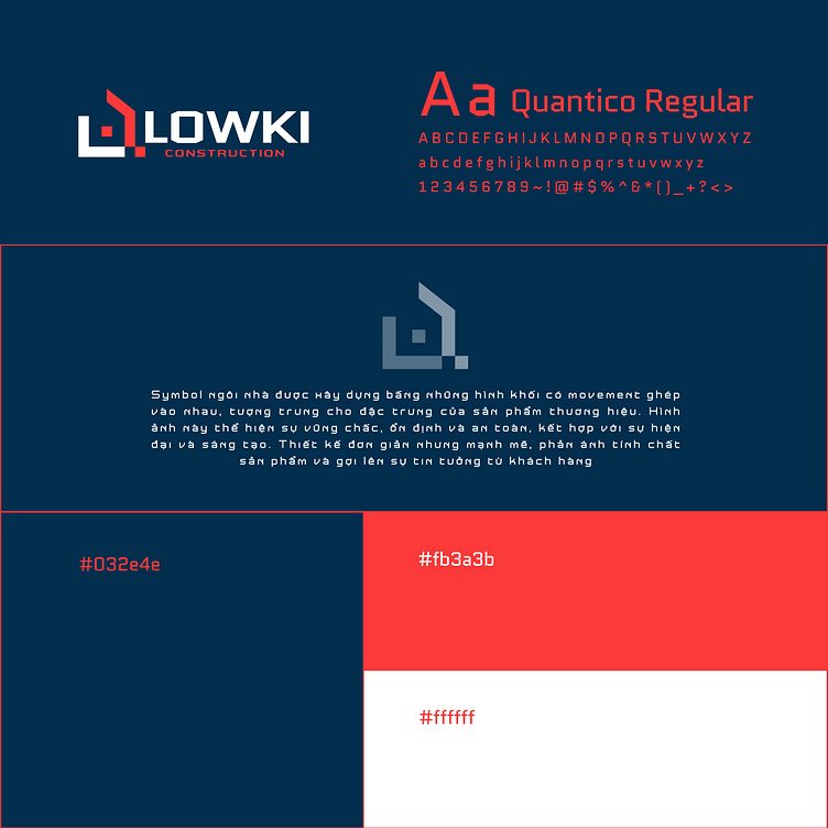
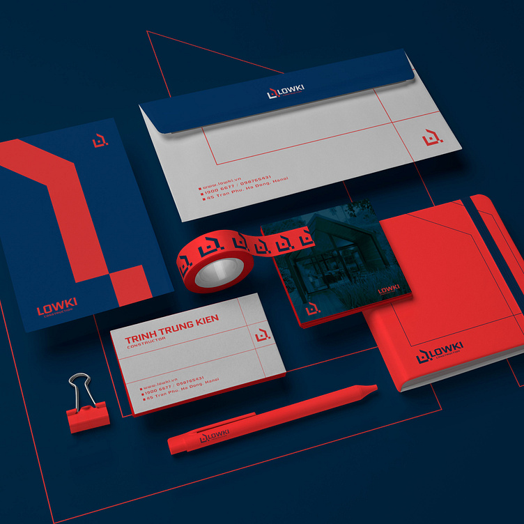
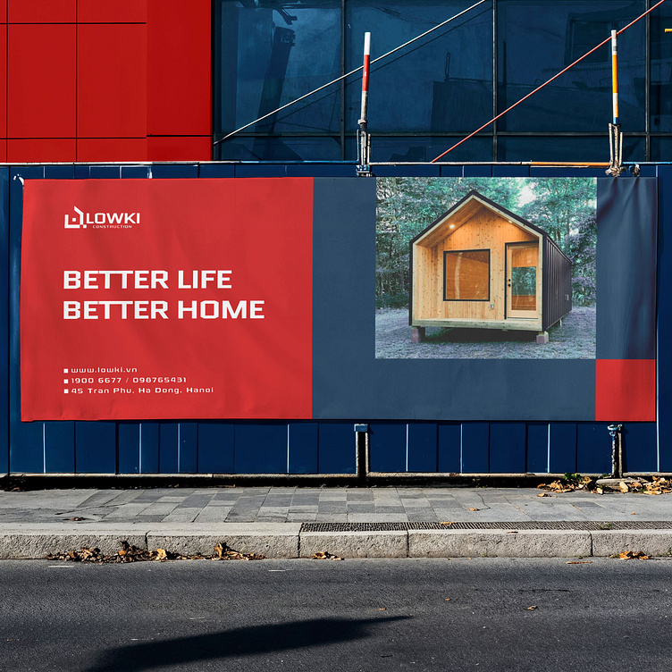
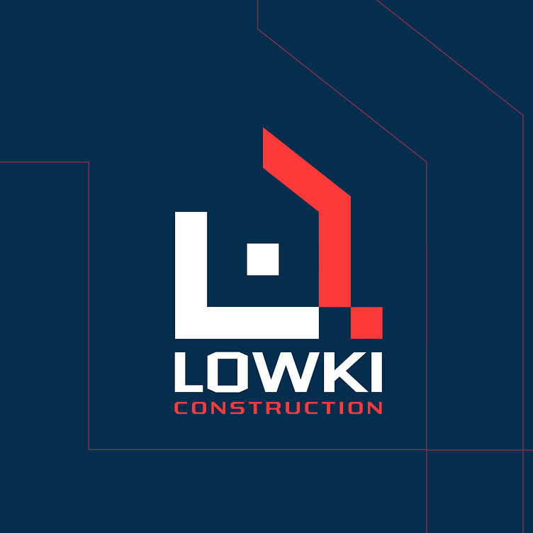
Lowki Construction's brand identity is built using 3 main colors: dark blue, red and white. Dark blue represents solidity, reliability and stability, very suitable for the construction industry. Red brings a sense of strength and power, demonstrating the company's ability to carry out large and complex projects. While white means perfection and high quality, demonstrating the company's attention to detail and commitment to providing works completed at the highest level. The combination of these three colors in the construction company's brand identity not only brings a sense of trust and professionalism but also easily creates a difference from other companies in the same industry.
The logo uses a house symbol combined with solid shapes that are characteristic of the brand's products, showing sustainability, stability and safety. The simple but powerful design clearly shows the nature of the company's products and services and evokes trust from customers.
-
Client Lowki
Logo Design Project. Logo is designed for Construction Company.
Copyright© Bee Art. All Right Reserved
Contact us:
• Hotline/ Zalo: (+84) 77 34567 18
• Email: info@beeart.vn
• Website: www.beeart.vn
• Facebook: https://www.facebook.com/BeeArt.vn