Economist Subscription Pricing
Disclaimer: Exploratory work. I don't know what constraints and decisions the Economist Digital team had to take into account in their live design.
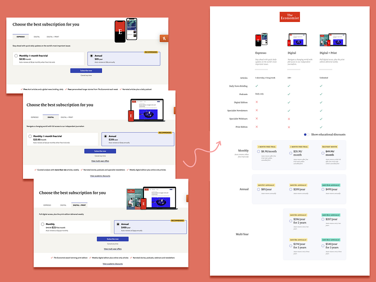
The original design required clicking through 3 tabs to see all the options.
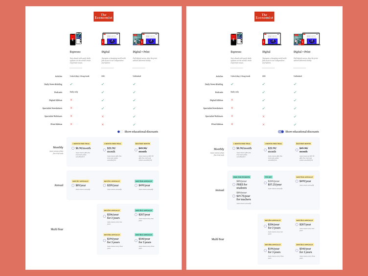
In my version, you can see all options in one page.
Benefits were extremely subtle at the bottom of the page below this highlighted section and hard to compare between plans.
I arranged the benefits into a table, which aids understanding-at-a-glance without sacrificing details for unique benefits like article quantity or which podcasts are included.
There was no way to compare all plans and pricing at once.
In my version, you can see multi-year plans and educational discounts alongside the base prices for each package.
Multi-year plans listed all pricing in total pricing, not broken down by year. For example, it's a lot harder to swallow a $500 lump sum price tag when you're not shown that you'd be saving $200+ annually.
I adjusted the pricing to reflect the per-year cost, not the lump sum total. While the lump sum to be charged is important to communicate, this could be added via helper text. I think it's more impactful and useful to the user to show a 1:1 comparison of like things: specifically the actual yearly cost for one, two, or three year plans.