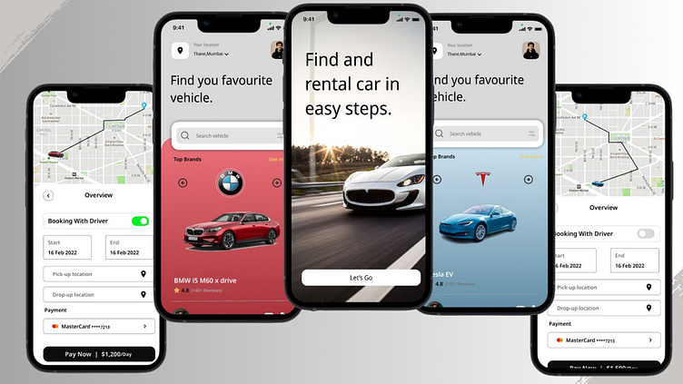
Car Rental App UI/UX Design
Introduction
Project Overview: This case study details the design process and rationale behind a car rental app. The app enables users to easily find and rent vehicles of their choice.
Problem Statement
Objective: The goal was to design a user-friendly interface that allows users to search, select, and rent cars efficiently.
Design Process
1. Wireframes
Initial Sketches: Discuss the initial wireframes that laid the foundation for the design. This could include sketches or low-fidelity wireframes.
2. Design Development
Home Screen:
Objective: Make it easy for users to begin the car rental process.
Design Choices:
Large, attractive imagery to engage users immediately.
A clear call-to-action (CTA) button ("Let's Go").
Vehicle Selection Screen:
Objective: Allow users to browse and select vehicles easily.
Design Choices:
A search bar for quick access to specific vehicle brands.
Highlighting top brands with engaging visuals.
Displaying vehicle specifications and rental prices clearly.
Booking Overview:
Objective: Provide a streamlined booking process with clear payment options.
Design Choices:
Toggle option for booking with or without a driver.
Input fields for start and end dates, pick-up, and drop-off locations.
Prominent payment section for ease of transaction.
3. Color Palette and Typography
Color Choices: The red and blue themes differentiate between the brands and enhance the visual appeal.
Typography: Discuss the chosen font style and its impact on readability and aesthetics.
We are available for new projects
Feel free to reach out to me if you want to create or revamp your website at
📧 Email: Mohammedahedsiddique@gmail.com
📞 Skype: Message us
💬 Whatsapp: Message us
💬 Fiverr: Message us


