Belay Car Company Logo Design
Belay Car Company Logo Design
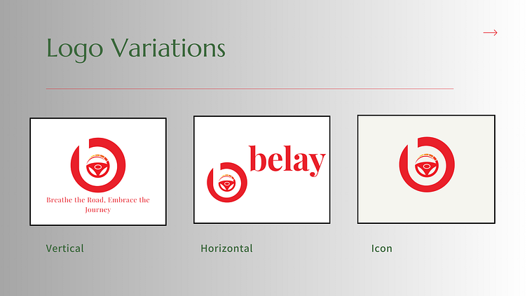
I designed the "Belay" logo to embody the spirit of adventure, innovation, and the thrill of the open road. The logo comes in three variations—vertical, horizontal, and icon—each crafted for versatile application across different marketing platforms, such as social media, business cards, and promotional materials.
Logo Elements:
Primary Symbol: The logo features a stylized letter "B" that merges seamlessly with a steering wheel and road, symbolizing control, direction, and the driving experience. This design reflects the automotive nature of the brand while conveying a sense of purpose and movement.
Color Palette: The bold red represents energy, passion, and excitement, while the gold accents in the steering wheel hint at luxury and high quality. These colors were carefully selected to create a striking visual that aligns with the brand's identity.
Typography: The font used for "Belay" is modern and clean, ensuring readability and prominence across various mediums. The horizontal version of the logo emphasizes the brand name, while the vertical and icon versions are perfect for more compact spaces, maintaining clarity and impact.
Slogan:
"Breathe the Road, Embrace the Journey": I crafted this slogan to capture the essence of the Belay brand. It invites drivers to fully immerse themselves in the driving experience, encouraging them to enjoy every moment on the road.
Versatility:
The logo's three variations ensure consistent branding across all platforms and materials. Whether used on social media, as a car sticker, or on business cards, the Belay logo remains impactful and instantly recognizable.
