Expenses management | Daily Ui Challenge 005
Design Challenge
Money Management Mobile App Screen
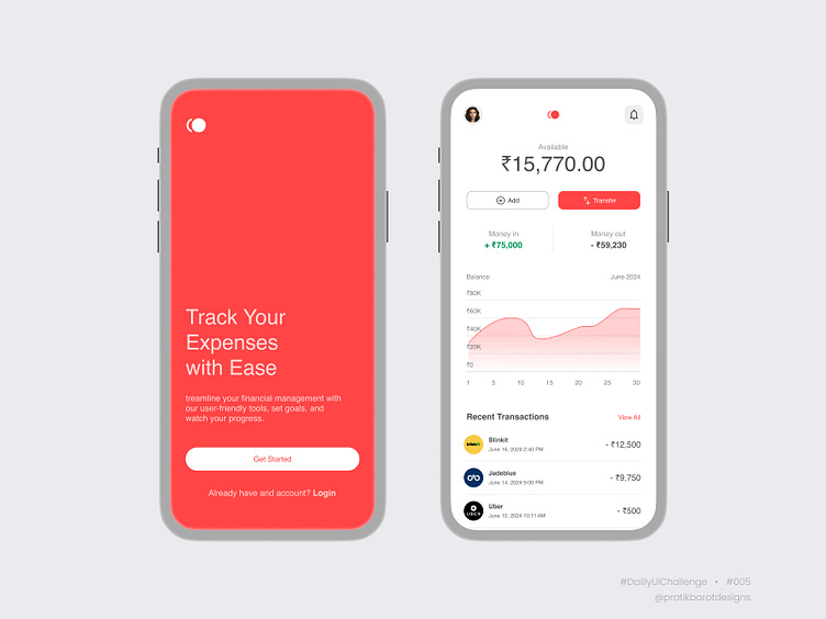
Design a user-friendly and visually appealing transaction details screen for a Money Management mobile application. The screen should display the available balance, facilitate manual transaction entries, and allow money transfers. The design should incorporate sections for "Money In" and "Money Out," a balance sheet graph per transaction, and a list of recent transactions, all while maintaining a professional and minimal colour scheme.
Competition Story
In the realm of mobile financial applications, delivering a seamless and intuitive user experience is paramount. This daily UI challenge on Dribbble focuses on designing a "Money Management" app's transaction details screen, offering an opportunity to exhibit expertise in mobile UI/UX design.
Using Figma, I aimed to craft a screen that balances functionality and aesthetics. The design prominently displays the available balance, ensuring users can quickly assess their financial status. Features for manually adding transactions and transferring money are easily accessible, enhancing user convenience.
Sections for "Money In" and "Money Out" provide a clear breakdown of financial activities, while the balance sheet graph offers a visual representation of transaction history. Recent transactions are listed at the bottom for quick reference. The use of professional and minimal colours ensures the design appears rich and sophisticated.
This challenge showcases how a well-designed interface can significantly improve user interaction and satisfaction in financial management applications.
Please review my vision for the #DailyUIChallenge design concept for the money management app.
Thank you for your support and feedback!
