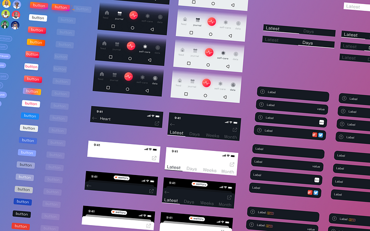
Welltory Design System
It was 2022, there were no Variables in Figma yet, and tokens were written in a list in json. The Welltory product was already 8 years old, but there was no full-fledged design system. The developers had their own disparate components, the designers had a set of colors and text styles and a couple of disparate components in Figma. At the same time, half of the application worked on the native, half on the Backend-driven UI. Everyone suffered: the developers had duplicates of almost identical components and icons. The designers leaked old components that went into the production with a new take.
My role
1. Saved developers from the task of manually updating text styles of colors and icons. They were automatically updated in the code after changes in Figma.
2. Accelerated the work of designers using components. Along with the development, I cleaned up the duplicates.
3. Set up the process of creating components using templates and instructions. Since my departure from the company, the design system has not broken down.
4. Accelerated development by reducing design issues. Situations where outdated components were used in the design or it was not clear how they worked have practically disappeared. The components and documentation helped with this.
5. Raised Jun into a strong middle man, able to assemble a flexible component and think through every condition.
